How to Visualize CSV Data Without Excel: The Fastest Way
By Kristoff
December 05, 2025
CSV (Comma-Separated Values) files are the universal language of data. They are lightweight, simple, and exported by almost every software from databases to bank accounts.
But looking at raw CSV data is painful. It's just a wall of text. To make sense of it, you need to visualize it. Traditionally, this meant opening Excel or Google Sheets, importing the file, cleaning columns, and wrestling with chart settings. But what if you just want to see a graph now?
Why Excel is Overkill for Simple Visualization
Spreadsheet software is powerful, but it's heavy. Using Excel to visualize a 10-line CSV file is like using a semi-truck to carry a single grocery bag.
- It's Slow: Opening the app, importing data, and selecting chart types takes clicks and time.
- It's Complex: You have to deal with cell formatting, headers, and specific rigorous structures.
- It's Not Always Available: You might be on a mobile device or a borrowed computer without Office installed.
The Solution: Direct CSV-to-Chart Visualization
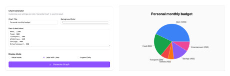
New online tools allow you to bypass the spreadsheet stage entirely. By pasting your CSV text directly into a browser-based tool, you can generate an instant visualization.
Our Chart Maker is built exactly for this purpose. It understands the "Comma-Separated" structure natively.
How to visualize your CSV data in 3 steps:
1. Open Your CSV File
Open your .csv file with any text editor (like Notepad or TextEdit). Do not open it in Excel. You will see raw text like this:
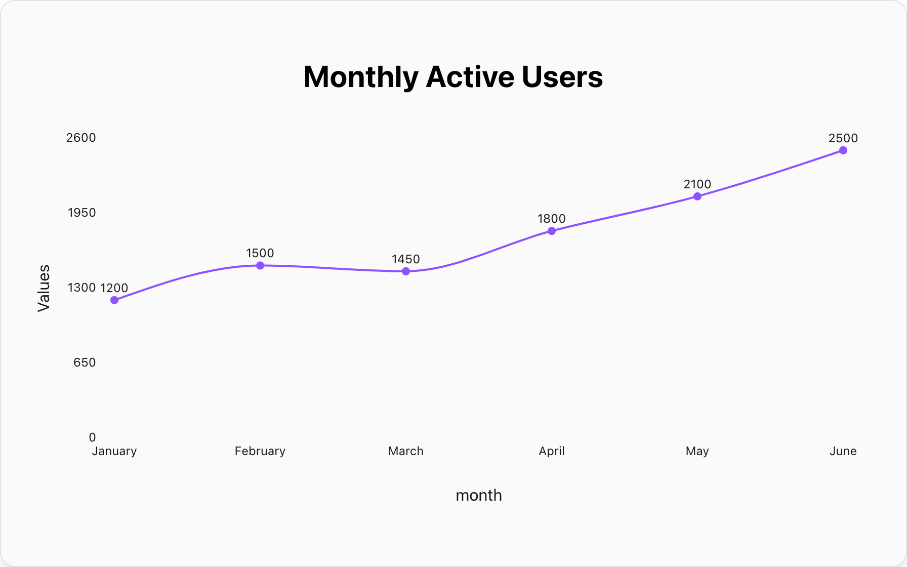
Month,Profit
January,5000
February,7200
March,4500
2. Copy and Paste
Select all the text and copy it. Then, paste it directly into our chart maker's input box. You don't need to separate columns or add headers manually.
3. Choose Your Chart
The tool will instantly look for patterns. If you are comparing categories, select Bar Chart. If you are showing a trend over time, switch to Line Chart.
Best Practices for CSV Visualization
To get the best results, ensure your CSV data is clean:
- Remove Extra Columns: If your dataset has 20 columns but you only want to plot "Date" vs "Sales", delete the other columns before pasting.
- Check for Headers: Our tool works best if the first row is a clear header (e.g., "Product, Price").
- One Series at a Time: For the simplest visualization, try to stick to two columns: one for the label (X-axis) and one for the value (Y-axis).
Popular Blogs