5 Common Mistakes in Data Visualization (And How to Fix Them)
By Kristoff
December 15, 2025

Data visualization is an art, but it's also a science. The goal isn't just to make something "pretty"; it is to make data understandable.
However, with so many design tools available, it's easy to get carried away. We often see charts that are cluttered, confusing, or downright misleading. Here are the 5 most common mistakes people make when creating charts—and simple rules to fix them.
Mistake #1 Using 3D Effects
The Problem: 3D charts might look "cool" or "modern," but they distort data. A 3D pie chart, for example, makes the slice at the front look significantly larger than the slices at the back, even if they are the same size. This ruins the accuracy of the visualization.
The Fix: Always stick to flat, 2D charts. They are clean, professional, and honest. Your audience will thank you for the clarity.
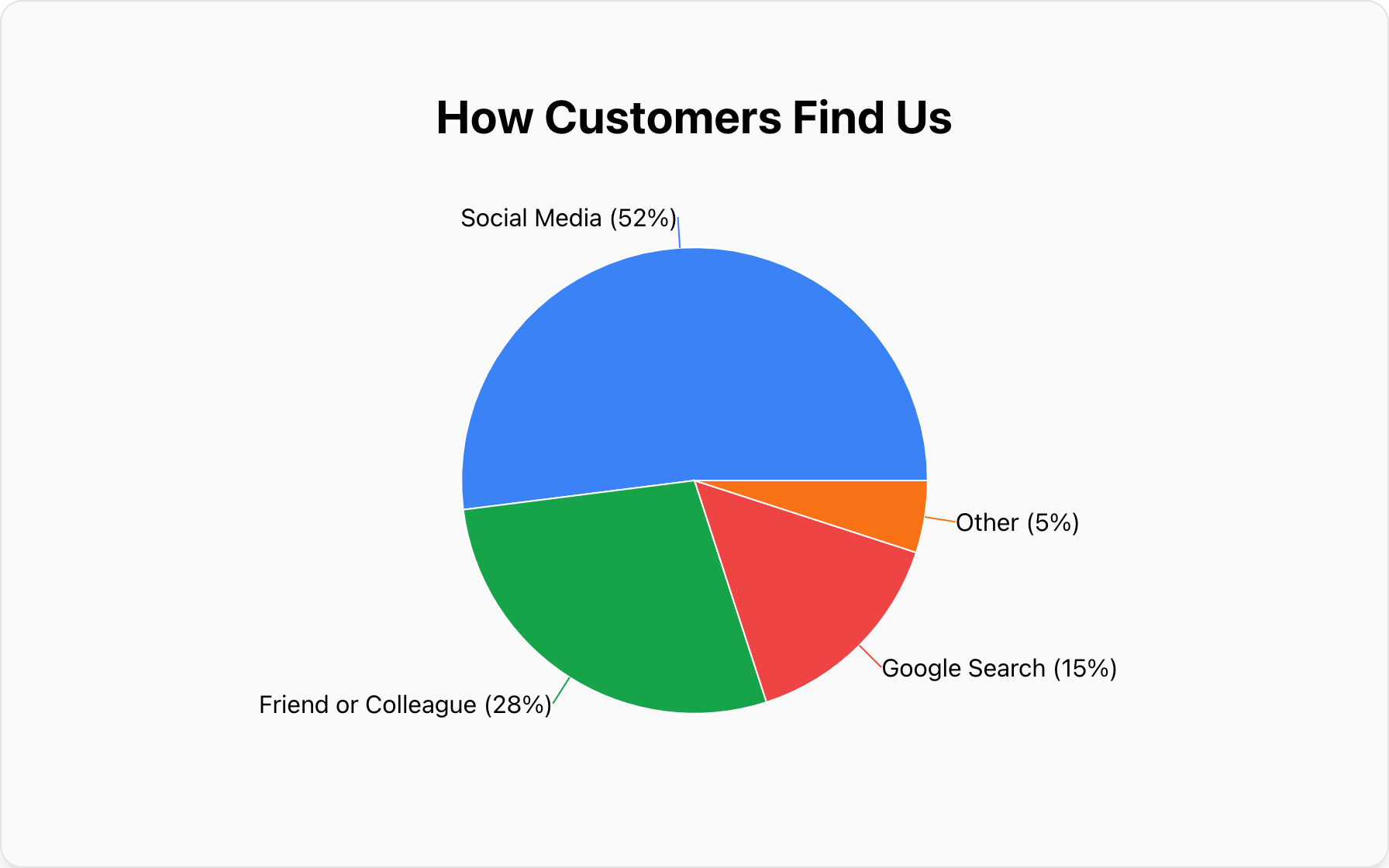
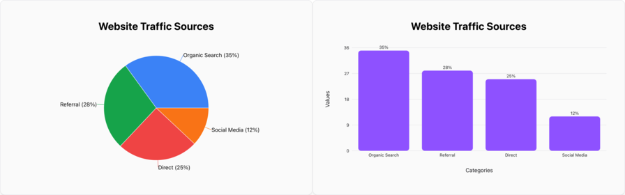
Mistake #2: Too Many Slices in a Pie Chart
The Problem: A pie chart with 15 thin slices is impossible to read. It forces the viewer to constantly cross-reference a legend, which is mentally exhausting.
The Fix: Follow the "Rule of 5." Limit your pie chart to 5 categories or fewer. If you have more data points, group the smallest ones into an "Other" category or switch to a Bar Chart, which can handle many more categories gracefully.
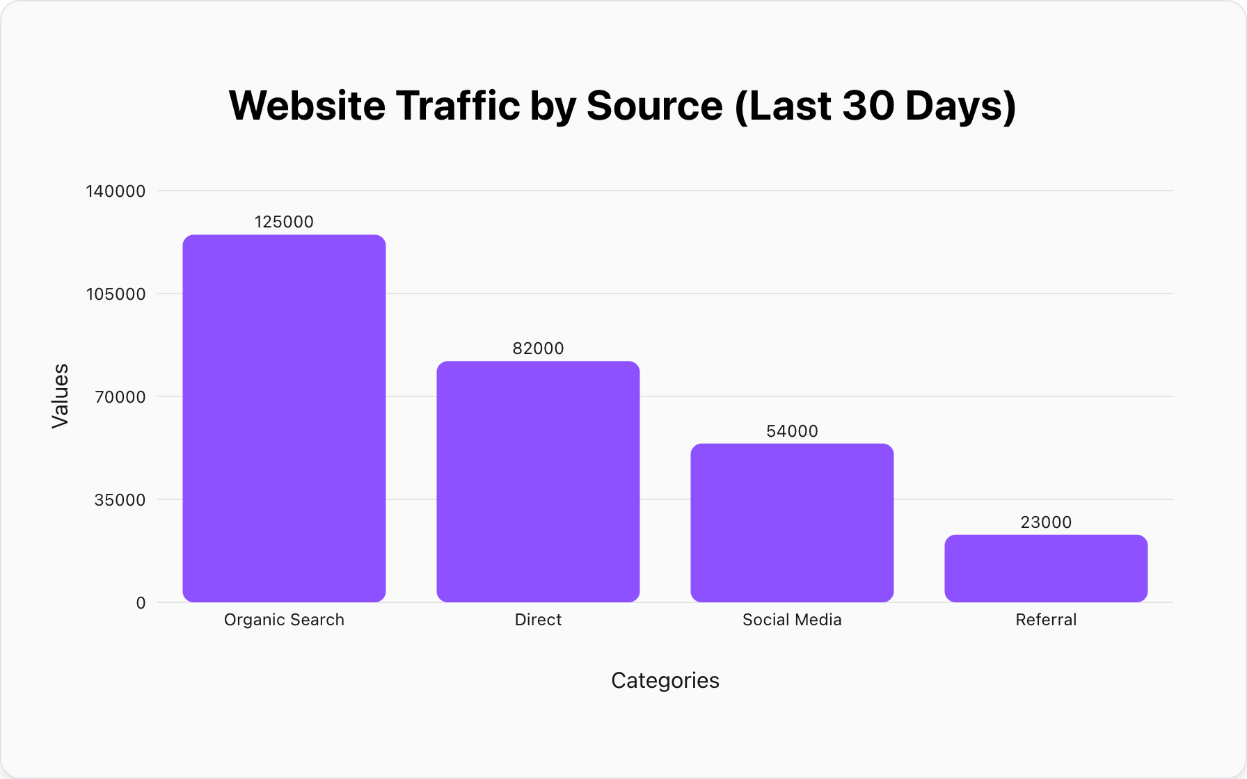
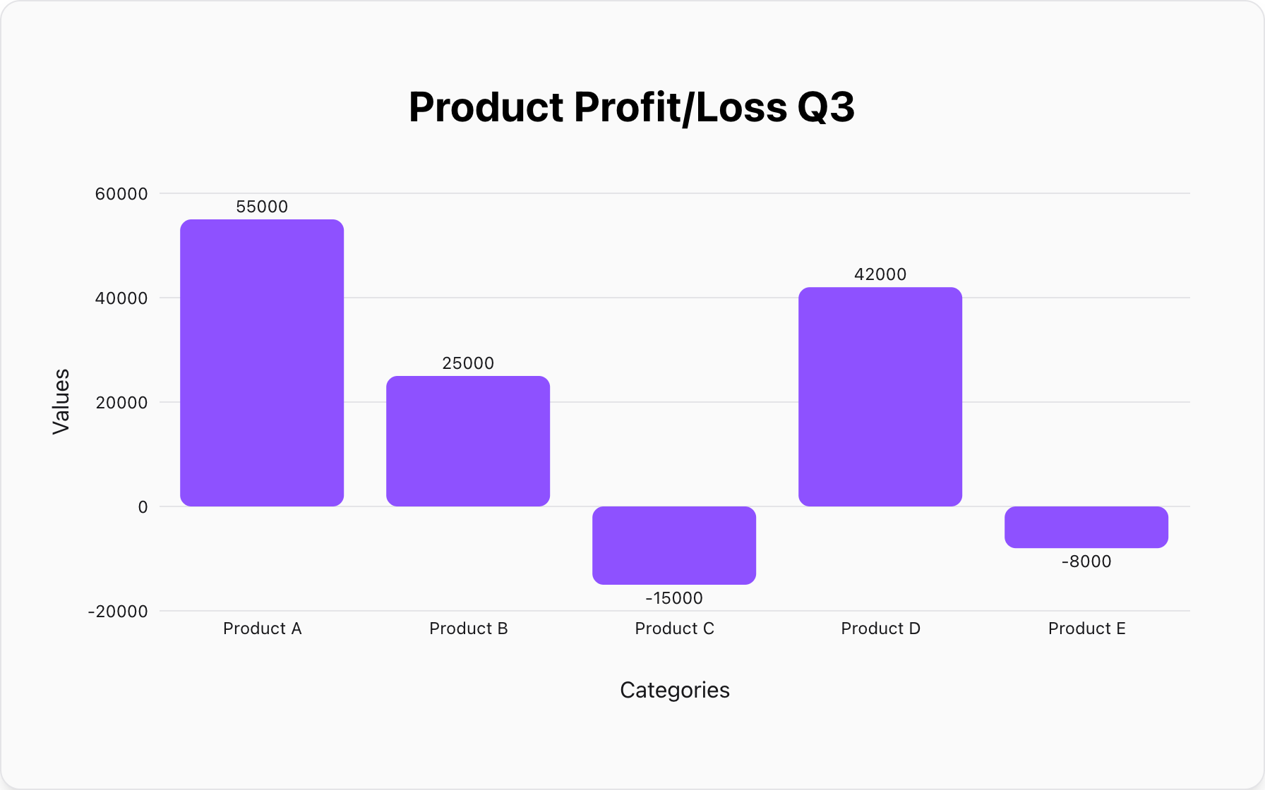
Mistake #3: Cutting the Y-Axis (Truncated Axes)
The Problem: Starting a bar chart's Y-axis at 50 instead of 0 makes a small difference look huge. If one bar is at 52 and another is at 54, a truncated axis makes the second bar look twice as tall as the first. This is misleading and manipulating.
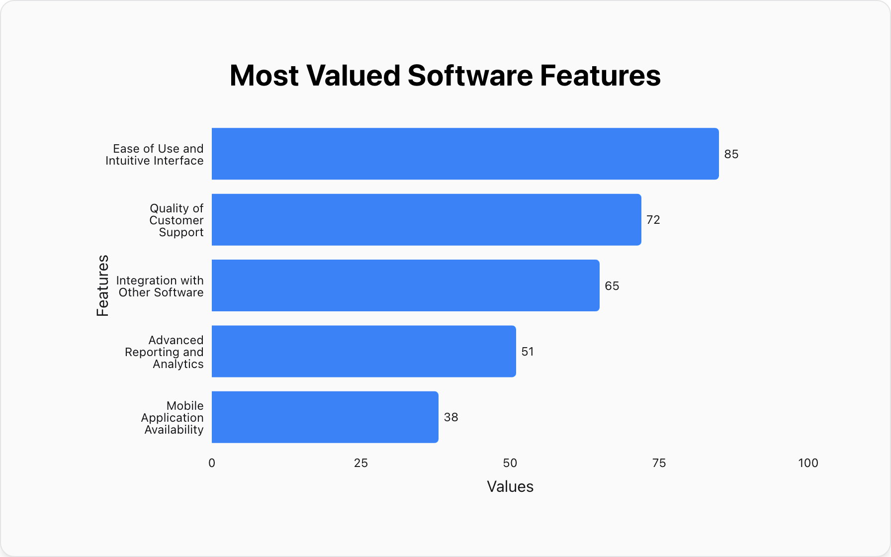
The Fix: Always start your bar chart axes at 0. This preserves the true proportional relationship between the values.
Mistake #4: Using Color Randomly
The Problem: Using a rainbow of colors for no reason distracts the viewer. It draws attention to everything, which means it draws attention to nothing.
The Fix: Use color strategically. Use one main color for the most important data point you want to highlight, and neutral colors (like gray) for the rest. Or, use a single color gradient to show intensity.
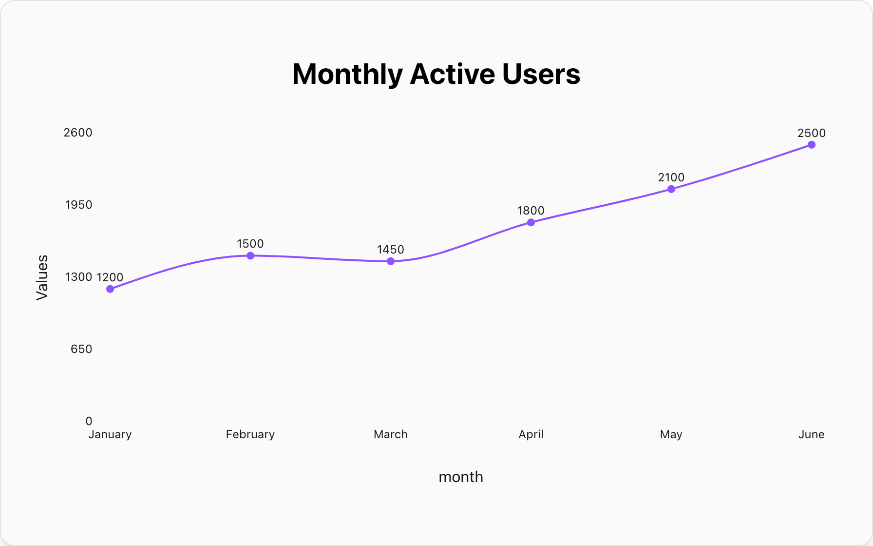
Mistake #5: Choosing the Wrong Chart Type
The Problem: Trying to show a trend over time with a pie chart? Or trying to show the parts of a whole with a line graph? Using the wrong tool for the job confuses the message instantly.
- Comparison: Use a Bar Chart.
- Composition (Parts of Whole): Use a Pie Chart.
- Trends over Time: Use a Line Chart.
Create Mistake-Free Charts
Our tool automatically applies these best practices. No 3D clutter, no truncated axes. Just clean, professional charts.
Make a Clean Chart NowPopular Blogs