What Is a Doughnut Chart Best Used For? The Definitive Guide
By Kristoff
November 10, 2025
Enter the doughnut chart: the stylish, modern cousin of the pie chart. With its clean aesthetic and a functional hole in the middle, the doughnut chart has become a favorite in dashboards and reports. But it's more than just a pie chart with a piece missing; that central space gives it a unique superpower.
So, when should you choose this circular chart? What is its true purpose, and how does it fundamentally differ from its solid counterpart? And how can you use that empty center to make your data even more impactful?
This definitive guide will answer those questions. We'll explore the doughnut chart's core mission, showcase perfect examples that leverage its design, cover key best practices, and provide a crystal-clear distinction between it and the classic pie chart.
When Should You Use a Doughnut Chart?
If you remember one thing, let it be this: A doughnut chart is best used for showing a part-to-whole relationship while using its central space to provide additional, high-level context.
Like a pie chart, its primary job is to display the percentage composition of a single whole. The entire ring represents 100%, and each arc is a percentage of that total. However, the hollow center is not just for style; it's a prime piece of real estate for displaying a key number, a total, or a summary icon. This transforms the chart from a simple composition view into a mini-dashboard.
"Think of a doughnut chart as a pie chart with a built-in headline. The ring shows the breakdown, and the center tells you the most important takeaway."
What Are the Best Use Cases for Doughnut Charts?
Let's see how this dual-purpose visualization shines in practice.
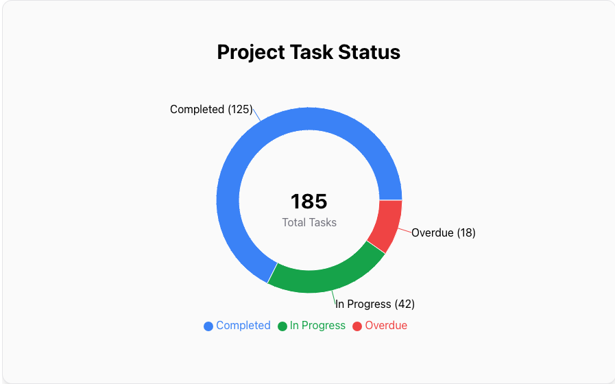
1. KPI Dashboards (e.g., Task Status)
Doughnut charts are perfect for dashboards where space is limited. You can show the breakdown of project tasks by status (Completed, In Progress, Overdue) and use the center to display the absolute total number of tasks.
Data for this Chart:
Doughnut Chart "Project Task Status"
Completed, 125
In Progress, 42
Overdue, 18
Center Text, 185 Total Tasks
2. Survey Results with a Key Takeaway
When presenting survey results, you can use the ring to show the distribution of all responses (e.g., Very Satisfied, Satisfied, Neutral) and use the center to highlight the most important summary metric, like the total percentage of satisfied customers.
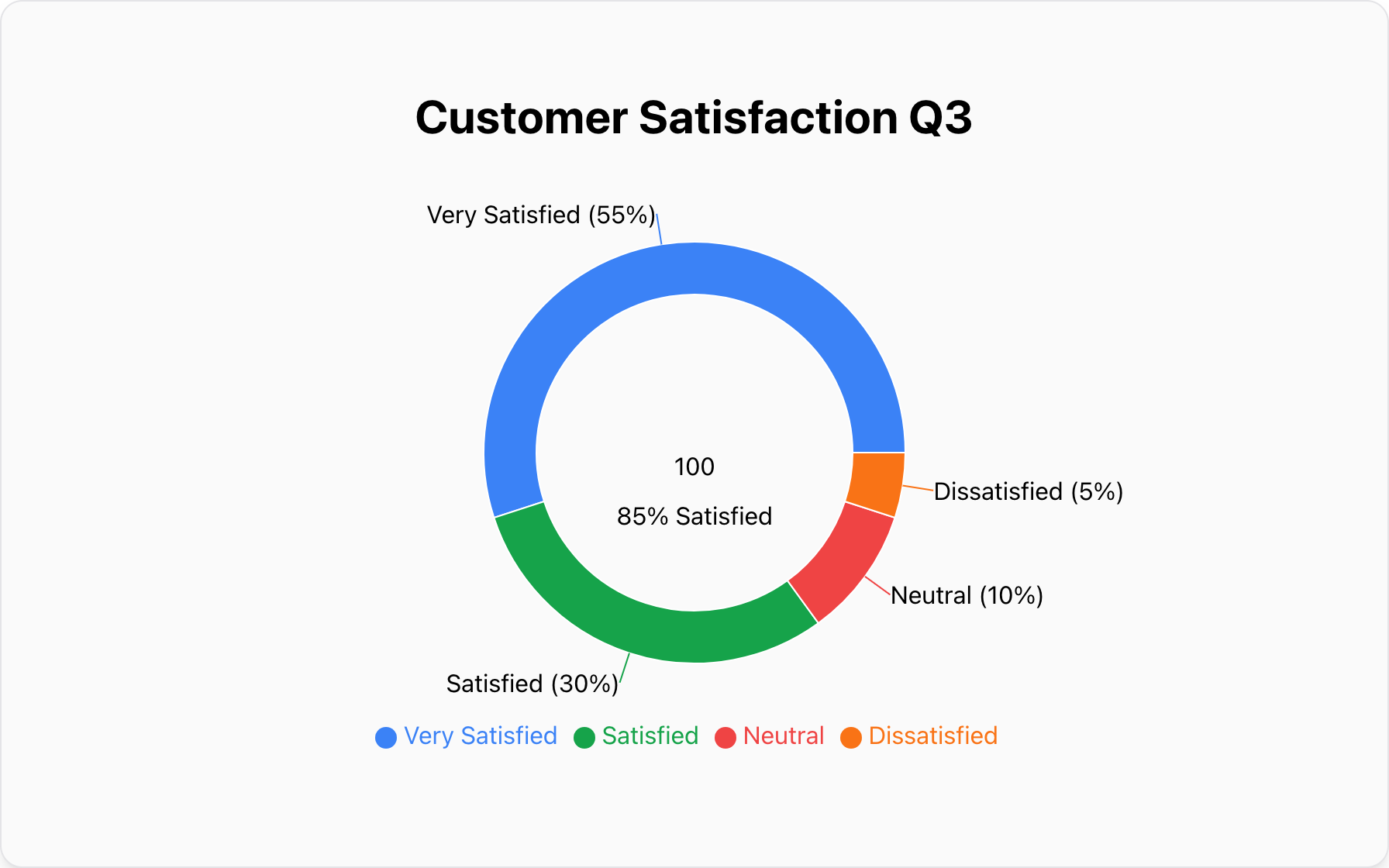
Data for this Chart:
Doughnut Chart "Customer Satisfaction Q3"
Very Satisfied, 55%
Satisfied, 30%
Neutral, 10%
Dissatisfied, 5%
Center Text, 85% Satisfied
How Do You Design an Effective Doughnut Chart?
Most of the design rules for pie charts also apply here: limit your slices, order them logically, and use color effectively. However, the key difference is how you treat the center.
The most critical decision is what to place in the hole. The best choices are:
- A Grand Total: The sum of all the slices.
- A Key Metric: A summary percentage or the most important category's value.
- An Icon: A simple icon that represents the chart's topic.
For a deep dive into the fundamental differences and when to choose one over the other, be sure to read our complete guide on what pie charts are best used for.
When Should You NOT Use a Doughnut Chart?
Like its solid cousin, the doughnut chart has clear limitations.
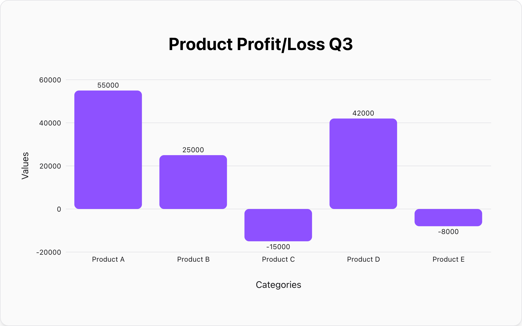
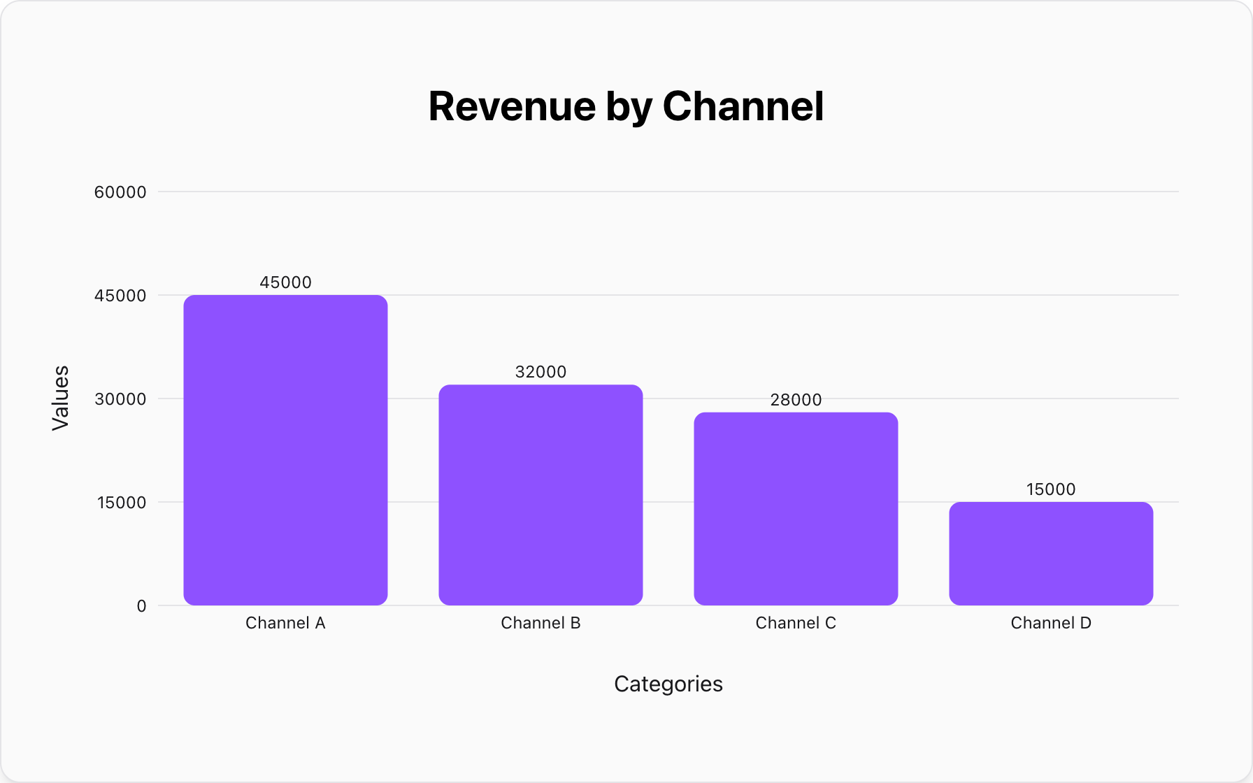
Mistake #1: Comparing Categories with Precision
The doughnut chart is even worse than a pie chart for precise comparison because the center of the angles is removed, forcing readers to compare arc lengths, which is very difficult.
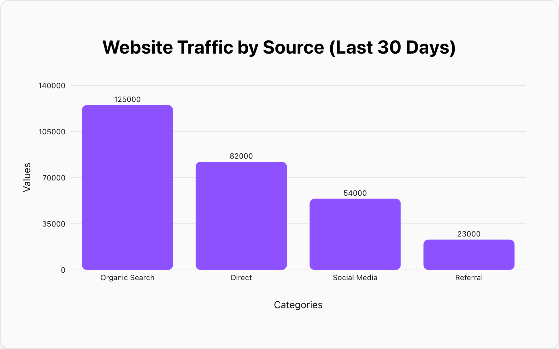
Better Alternative: A Bar Chart.For comparing values across categories, nothing beats the clarity of a bar chart.
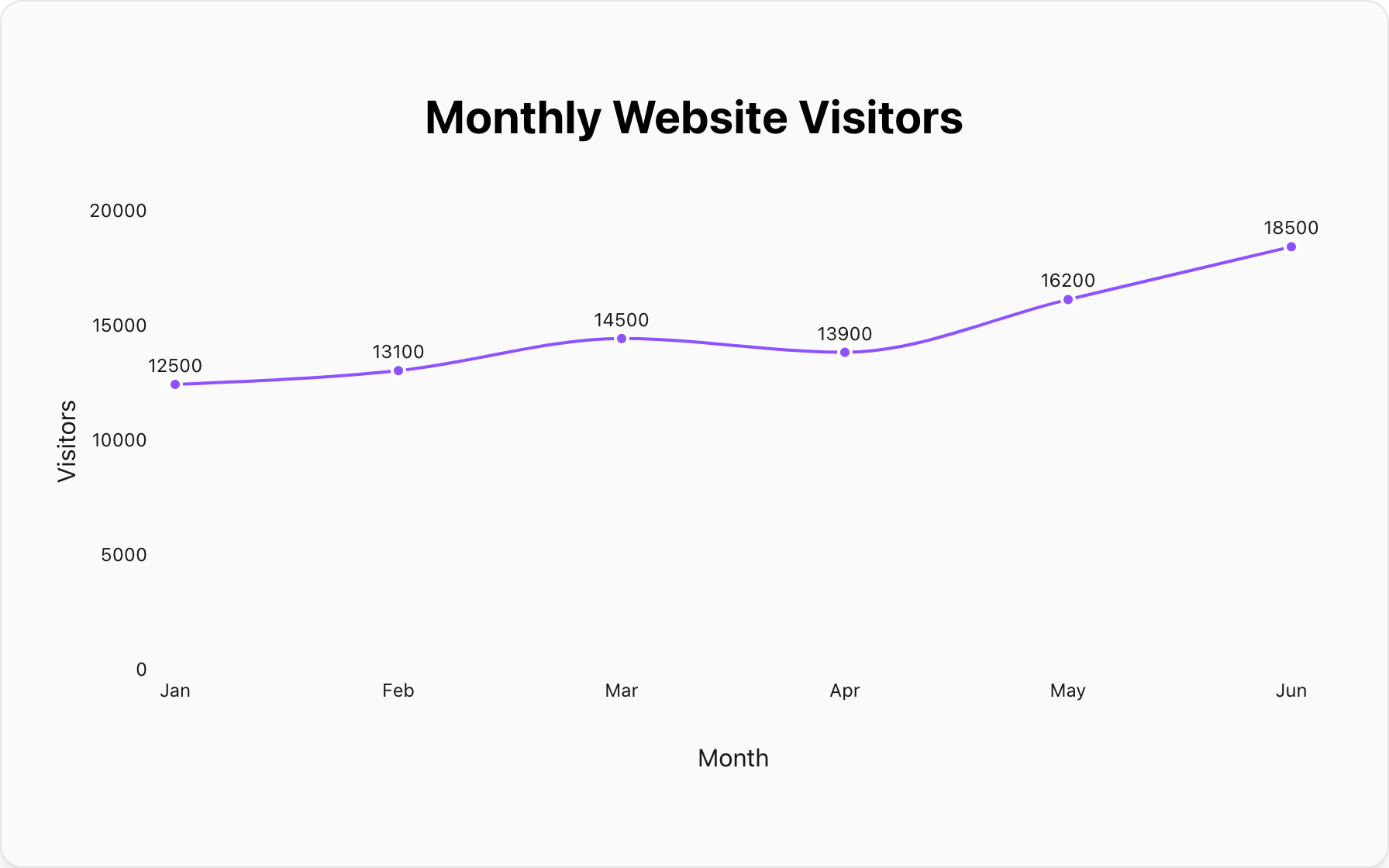
Mistake #2: Showing Data Over Time
A doughnut chart is a snapshot of a single moment. It cannot show trends, progress, or changes over a time period. Using a series of doughnut charts is highly ineffective.
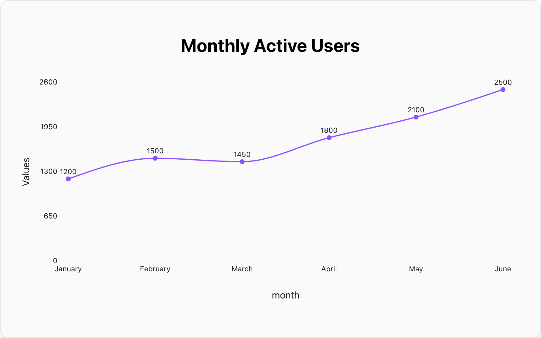
Better Alternative:A Line Graph.A line graph is specifically designed to tell a story of change over a continuous interval.
Conclusion: A Pie Chart with a Focal Point
The doughnut chart is not just a stylistic choice; it's a functional upgrade to the pie chart. It performs the same core task—showing the composition of a whole—but adds a valuable space for context and summary.
When your goal is to present a simple percentage breakdown while simultaneously highlighting a crucial total or key performance indicator, the doughnut chart is the best and most efficient tool for the job.
Ready to create your own dashboard-ready visualization? You can make a clear and insightful doughnut chart for free with our tool. Paste your data, add your center text, and create a professional chart in seconds.
Popular Blogs