What Is a Horizontal Bar Chart Best Used For? The Definitive Guide
By Kristoff
November 10, 2025
We've already established that the standard bar chart is the king of comparison. But what about its sibling, the horizontal bar chart? It might seem like a simple rotation, a matter of style, but the choice to go horizontal is one of the most important functional decisions you can make for data clarity.
The horizontal bar chart is a specialist, a problem-solver. It excels in scenarios where a standard vertical bar chart (often called a column chart) would fail, creating a cluttered and unreadable mess.
This definitive guide will uncover the specific superpower of the horizontal bar chart. We'll explore its ideal use cases, explain its fundamental advantage over its vertical counterpart, and show you exactly when it's the best—and only—choice for your data.
The Golden Rule: Use It for Comparing Categories with Long Labels
If you remember only one thing, let it be this: A horizontal bar chart is best used for comparing numerical values across categories when the category names are long or numerous.
This is its defining purpose. The human eye reads text horizontally from left to right. A horizontal bar chart respects this natural flow, giving long labels ample space to be displayed clearly and legibly. A vertical chart, by contrast, would force you to use angled, vertical, or truncated labels, which are all difficult to read and create a poor user experience.
"Choose a horizontal bar chart when you want to give your data labels room to breathe. It prioritizes the readability of your categories, making it the champion of clarity."
Real-World Examples: The Best Use Cases for Horizontal Bar Charts
Let's see this principle in action in scenarios where it is the clear winner.
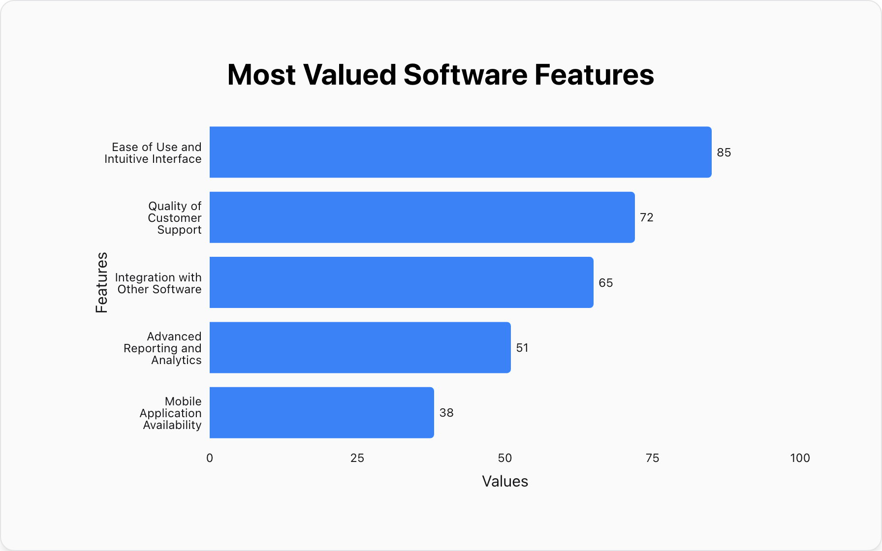
1. Detailed Survey Results
Survey questions often result in long, descriptive answers. Trying to fit "Integration with other software" or "Quality of customer support" on a vertical axis is a design nightmare. The horizontal format handles this effortlessly.
Data for this Chart:
Horizontal Bar Chart "Most Valued Software Features"
Ease of Use and Intuitive Interface, 85
Quality of Customer Support, 72
Integration with Other Software, 65
Advanced Reporting and Analytics, 51
Mobile Application Availability, 38
2. Ranking Data with Long Names (e.g., Countries, People)
When ranking items with long proper names, such as countries, states, or individuals, the horizontal bar chart is the only choice. It provides a clean, ranked list that is easy to read from top to bottom.
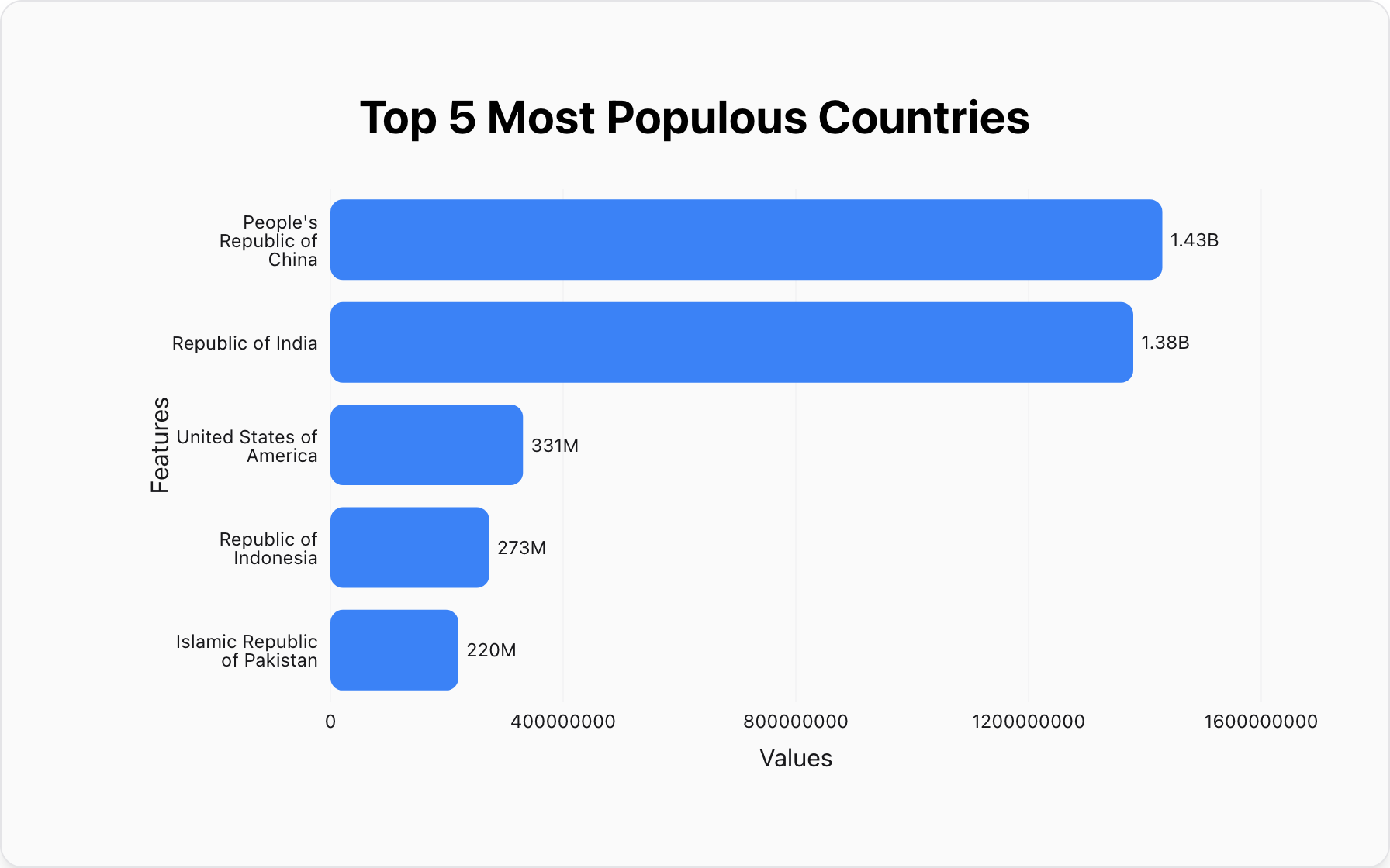
Data for this Chart:
Horizontal Bar Chart "Top 5 Most Populous Countries"
People's Republic of China, 1.43B
Republic of India, 1.38B
United States of America, 331M
Republic of Indonesia, 273M
Islamic Republic of Pakistan, 220M
The Key Advantage: Vertical vs. Horizontal
The choice is simple. Ask yourself: "Are my category labels short and simple?"
- If yes (e.g., "Q1", "Q2", "USA", "UK"), a standard vertical bar chart is an excellent choice.
- If no (e.g., "North American Division", "Q3 Marketing Spend"), a horizontal bar chart is superior.
For a full breakdown of the core principles of bar charting, be sure to read our ultimate guide on what bar charts are best used for.
Critical Mistakes: When NOT to Use a Horizontal Bar Chart
Even this readability champion has its limits. Like all bar charts, it is not suitable for every data story.
Mistake #1: Showing Trends Over Time
While you can display time-based categories (e.g., months), a bar chart does not effectively show the continuous flow and rate of change that a trend line does.
Better Alternative:A Line Graph.A line graph is purpose-built to illustrate the story of data changing over a continuous interval.
Conclusion: The Readability Champion
The horizontal bar chart is more than a stylistic choice; it's a decision to prioritize clarity. Its primary function is to solve the problem of long, complex category labels, ensuring your audience can quickly understand both the data and its context without tilting their heads.
When your data involves detailed descriptions, long names, or a large number of categories to rank, the horizontal bar chart is unequivocally the best tool for the job.
Ready to create a chart that's as readable as it is insightful? You can make a perfectly clear horizontal bar chart for free with our tool.
Popular Blogs