What Are Pie Charts Best Used For? The Definitive Guide
By Kristoff
October 30, 2025
In the vast universe of data visualization, the humble pie chart is a superstar. It's instantly recognizable, universally understood, and one of the first charts anyone learns to make. Yet, it's also one of the most debated and frequently misused tools in the entire data viz toolkit.
So, what's the real story? When does a pie chart transform from a simple circle into a powerful communication tool? And when does it become a confusing, misleading mess?
This definitive guide will answer those questions and more. We'll dive deep into the core purpose of pie charts, explore perfect real-world examples, cover essential design principles, and, most importantly, show you when to choose a more effective alternative. By the end, you'll be able to use pie charts with the confidence of a seasoned data expert.
When Should You Use a Pie Chart?
If you remember only one thing from this article, let it be this: Pie charts have one primary, powerful purpose: to show the proportional composition of a single whole.
In other words, they answer the question: "What percentage of the total does each category represent?" The entire pie represents 100%, and each slice is a percentage of that total. This part-to-whole relationship is their unique strength. If your data doesn't add up to a meaningful total, a pie chart is the wrong choice, period.
"Think of a budget, a survey's total respondents, or a company's total market share. These are all a single 'whole' that can be broken down into parts. This is where pie charts shine."
What Are the Best Use Cases for Pie Charts?
Theory is great, but let's see it in action. Here are some of the most common and effective scenarios for using a pie chart, complete with data you can use.
1. Market Share Analysis
One of the most classic uses is showing how the market is divided among competitors. It instantly communicates who the major and minor players are.

Data for this Chart:
Pie Chart "Global Smartphone OS Market Share"
Android, 72%
iOS, 27%
Other, 1%
2. Budget and Expense Breakdowns
Whether for a household, a small business, or a corporate department, a pie chart is an excellent way to visualize where the money is going. It gives a quick overview of the biggest areas of expenditure.
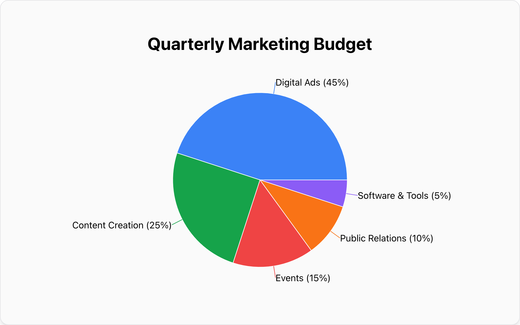
Data for this Chart:
Pie Chart "Quarterly Marketing Budget"
Digital Ads, 45%
Content Creation, 25%
Events, 15%
Public Relations, 10%
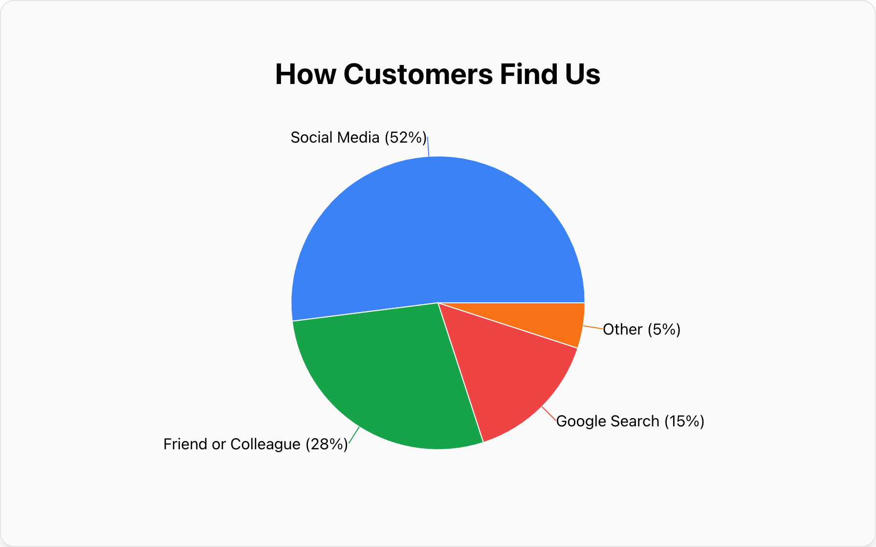
Software & Tools, 5%3. Survey and Polling Results
When you have results from a single-choice question ("What is your favorite...?", "Which feature do you use most?"), a pie chart is perfect for summarizing the distribution of answers.
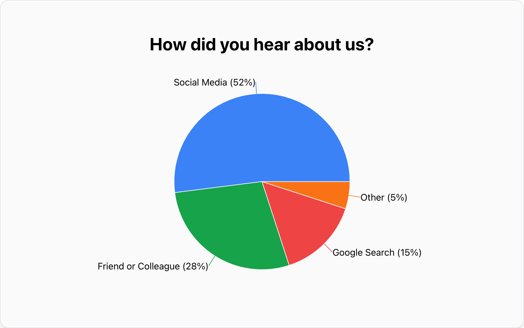
Data for this Chart:
Pie Chart "How did you hear about us?"
Social Media, 52%
Friend or Colleague, 28
Google Search, 15%
Other, 5%
4. Student Projects & Research
For students, pie charts are a staple in science fair projects and research papers. They are perfect for visualizing categorical data like "Transportation Methods to School" or "Favorite School Subjects".
Pro Tip: While you might be tempted to use a pie chart for student heights, remember that heights are continuous data. Unless you group them into ranges (e.g., 150-160cm), a histogram or bar chart is usually a better choice!
How Do You Design an Effective Pie Chart?
A great pie chart isn't just about the data; it's about the design. A poorly designed chart can be just as confusing as using the wrong chart type. Follow these rules to ensure your message is crystal clear.
1. Limit Your Slices (The "5-Second Rule")
Your audience should be able to understand your chart in about five seconds. The more slices you add, the harder this becomes. As a rule of thumb, try to keep your pie chart to 5 or fewer categories. If you have more, the slices become too thin to be visually distinct. Group the smallest, less significant categories into a single "Other" slice.
2. Order Slices Intuitively
Don't present your data randomly. The best practice is to order the slices from largest to smallest, starting at the 12 o'clock position and moving clockwise. This creates a logical flow and makes it easier for the eye to follow and compare the most significant categories first.
3. Use Color for Clarity, Not Decoration
Color should differentiate, not distract. Use a distinct color for each slice. A good approach is to use your main brand color for the largest, most important slice and then use neutral or complementary shades for the others. Always consider color blindness by choosing palettes that have high contrast.
4. Label Slices Directly
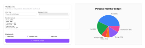
Avoid using a separate legend whenever possible. A legend forces the viewer's eyes to dart back and forth between the chart and the key, increasing cognitive load. Instead, label each slice directly with the category name and its percentage value. An effective pie chart maker will do this for you, making your visualization self-contained and instantly understandable.
5. Avoid 3D, Exploding Slices, and Other Gimmicks
This is critical. While they might seem visually exciting, 3D effects and "exploding" slices are the enemies of data integrity. They distort the size and area of the slices, making accurate comparison impossible. The slice closest to the viewer appears larger than it really is. Stick to a clean, flat 2D design for honest and clear communication.
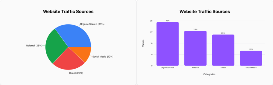
Pie Chart vs. Bar Graph: Which One Wins?
The battle of pie chart vs bar graph is common. Here is a quick cheat sheet to help you decide:
- Use a Pie Chart when you want to show how a single whole is broken down into parts (composition). Example: Market share.
- Use a Bar Chart when you want to compare different categories side-by-side or see ranking. Example: Sales by region.
When Should You NOT Use a Pie Chart?
Knowing when to put the pie chart down is just as important. Using it in the wrong scenario will obscure your message.
Mistake #1: Comparing Categories Against Each Other
If the primary goal is to see which category is bigger or smaller, a pie chart is a poor choice. The human eye is not good at accurately comparing angles and areas. We are, however, excellent at comparing lengths.
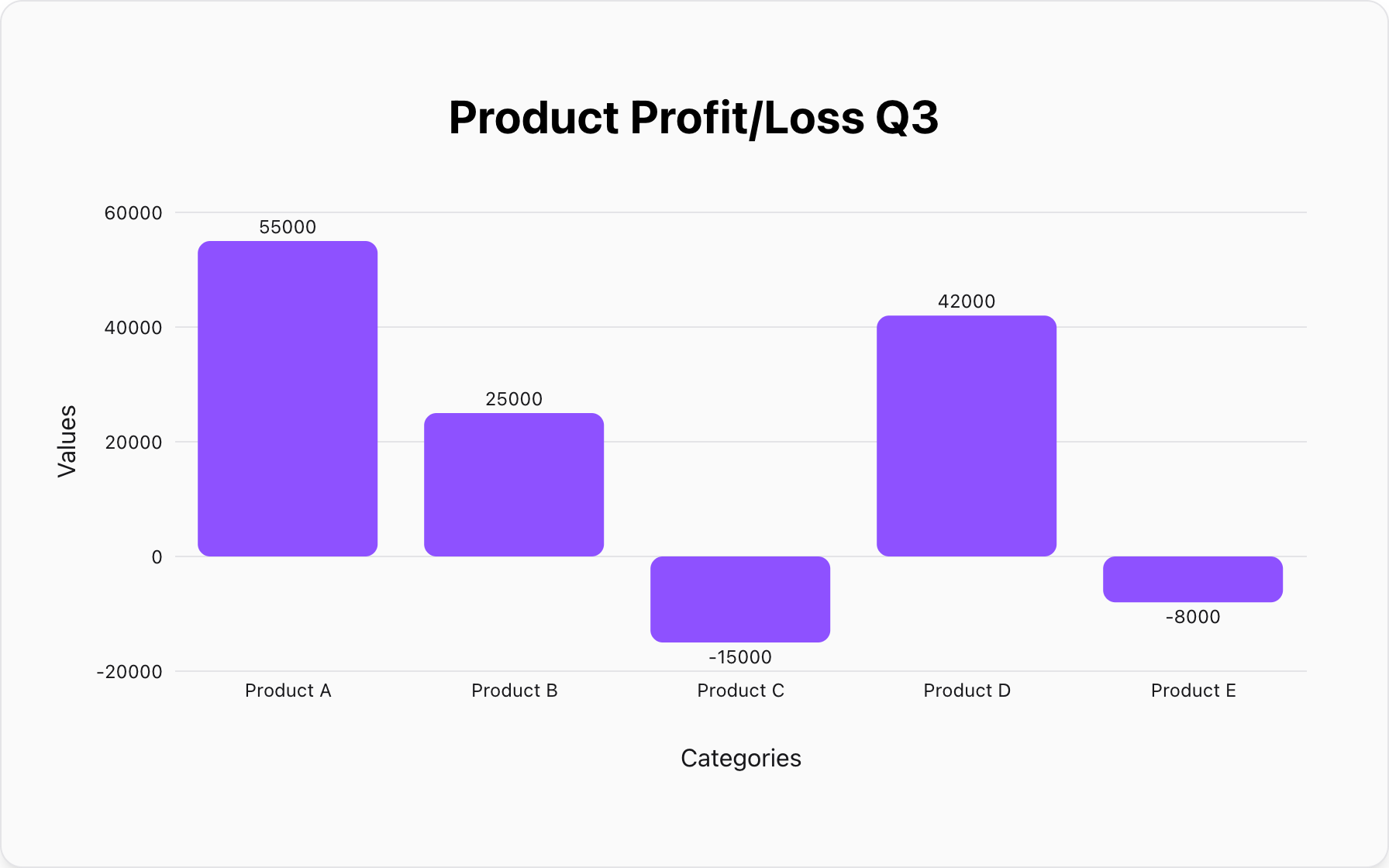
Better Alternative: A Bar Chart.A simple bar chart makes comparison effortless.
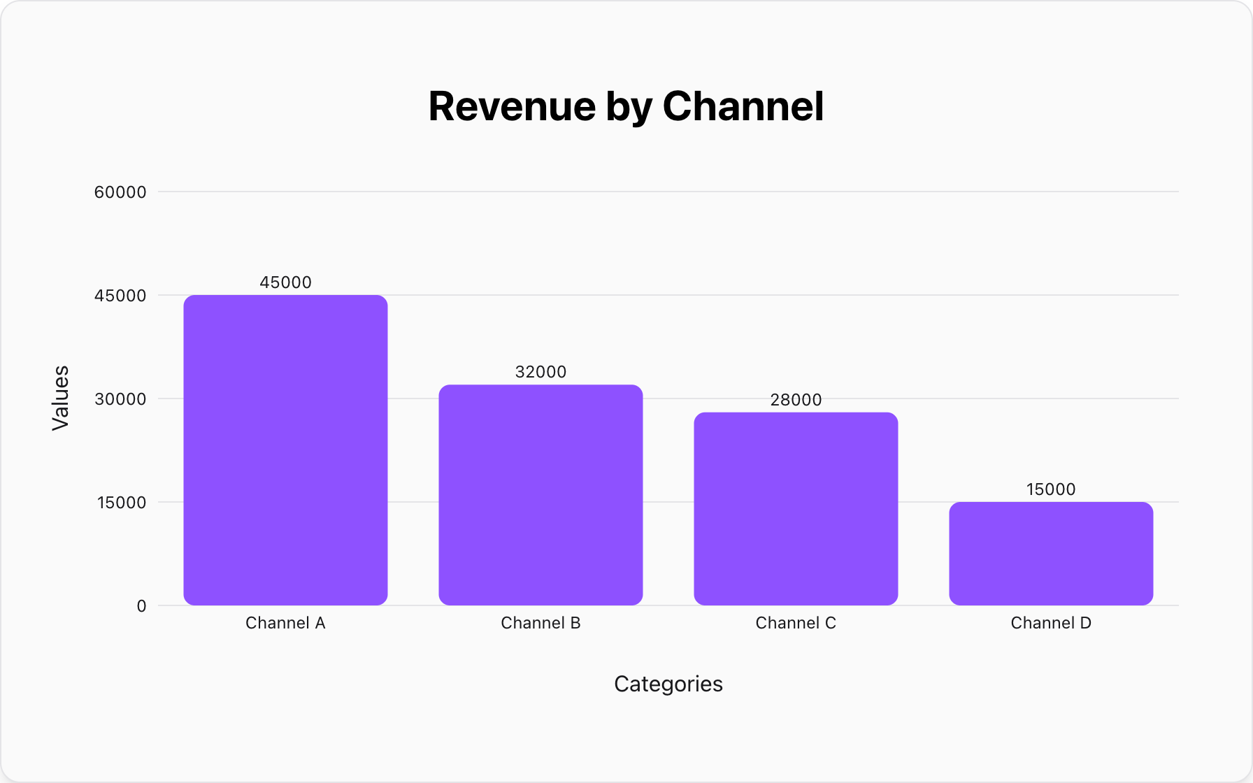
Data for this Chart (Bar Chart):
Bar Chart "Revenue by Channel"
Channel A, 45000
Channel B, 32000
Channel C, 28000
Channel D, 15000
Mistake #2: Showing Trends or Changes Over Time
This is perhaps the most common and damaging misuse of a pie chart. A pie chart is a snapshot of a single moment in time. To show how data changes across days, months, or years, a pie chart is completely ineffective. A series of pie charts is even worse, as it's nearly impossible to track how a single slice changes across them.
Better Alternative:A Line Chart..A line chart is specifically designed to display trends over a continuous time period.
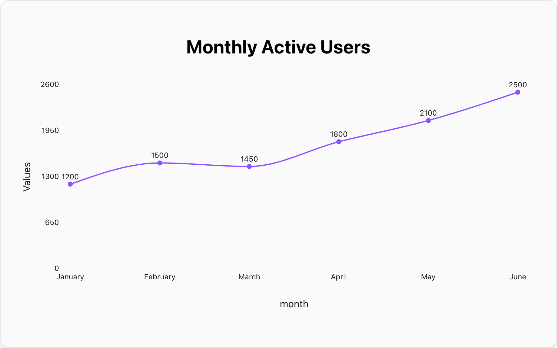
Data for this Chart (Line Chart):
Line Chart "Monthly Active Users"
January, 1200
February, 1500
March, 1450
April, 1800
May, 2100
June, 2500
Conclusion: Use Pie Charts Wisely
The pie chart is a specialized tool, not a one-size-fits-all solution. It is brilliant for its one core job: showing the percentage composition of a whole. When used for that purpose and designed with clarity in mind, it can be an invaluable asset in your communication toolkit.
By understanding its strengths and respecting its limitations, you can avoid common pitfalls and ensure your data story is always told clearly, accurately, and effectively.
Ready to put these principles into practice? You can create your own perfect pie chart for free with our tool. Just paste your data, and we'll handle the design best practices for you. Build a chart that informs, not confuses, in just a few seconds.
Popular Blogs