What Are Bar Charts Best Used For? The Ultimate Guide
By Kristoff
November 3, 2025
If the pie chart is the well-known superstar of data visualization, then the bar chart is the reliable, powerful workhorse. It's versatile, intuitive, and arguably the most effective chart for a wide range of data stories. While other charts have very specific jobs, the bar chart is a master of one of the most fundamental tasks in data analysis: comparison.
But what makes it so effective? When should you choose a bar chart over a line chart or a pie chart? And how can you take your bar charts from basic to brilliant?
This definitive guide will answer all these questions. We'll establish the bar chart's primary purpose, explore its different types with real-world examples, cover non-negotiable design rules, and clarify exactly when to use a different chart. By the end, you'll understand why the bar chart is an indispensable tool for clear and honest data communication.
When Should You Use a Bar Chart?
If you remember just one thing, let it be this: Bar charts are best used for comparing numerical values across discrete categories.
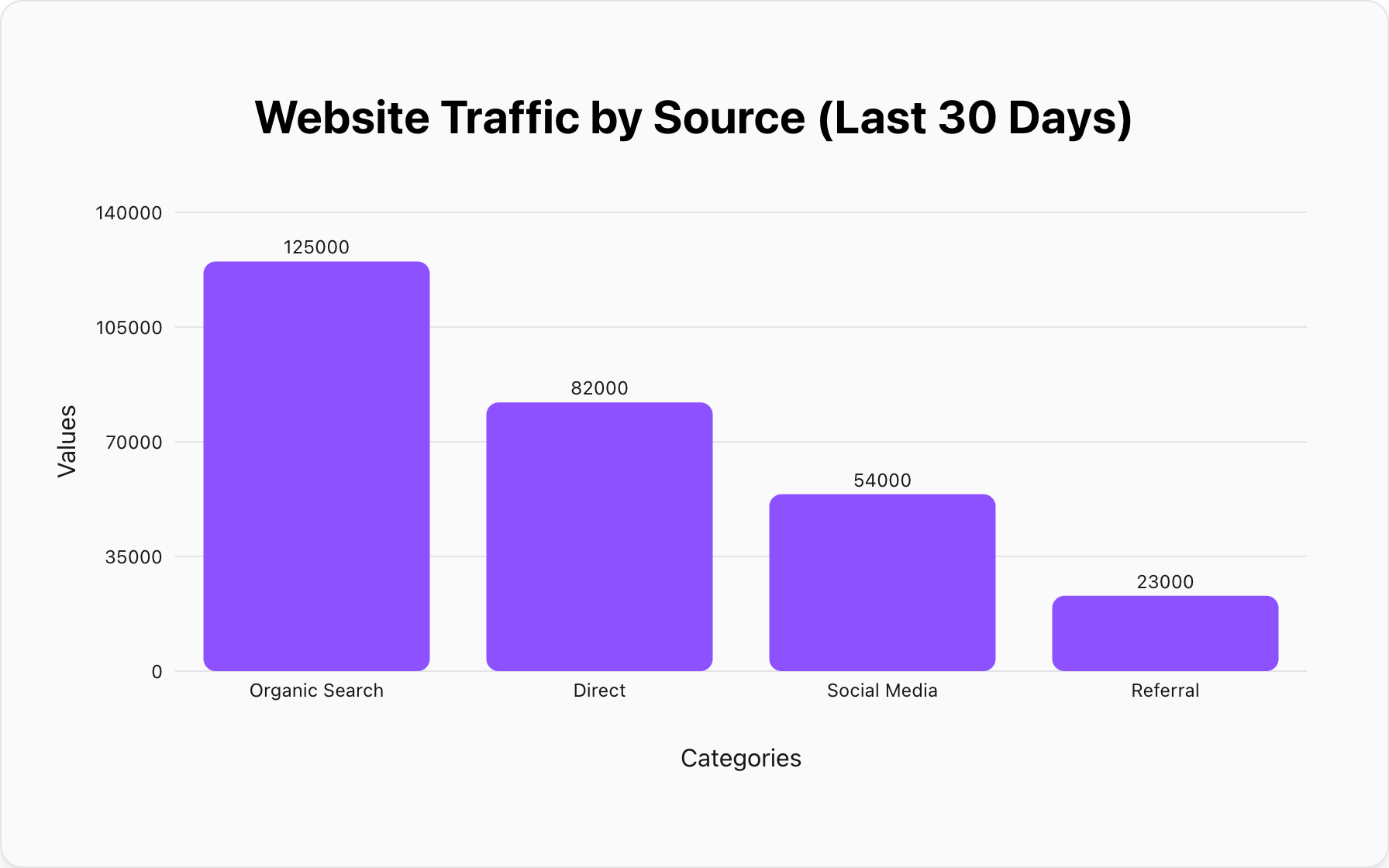
The reason is rooted in human psychology. Our brains are incredibly good at comparing the lengths of objects lined up against a common baseline. We can instantly and accurately see which bar is longer, which is shorter, and by roughly how much. This makes bar charts the undisputed champion of comparison, whether you're ranking sales figures, comparing website traffic sources, or showing survey responses.
"While a pie chart shows you how a whole is divided, a bar chart shows you how different wholes stack up against each other. It answers the question: 'How much?' for each category."
What Are the Best Use Cases for Bar Charts?
Let's see this principle in action. Here are some of the most effective scenarios for using a bar chart.
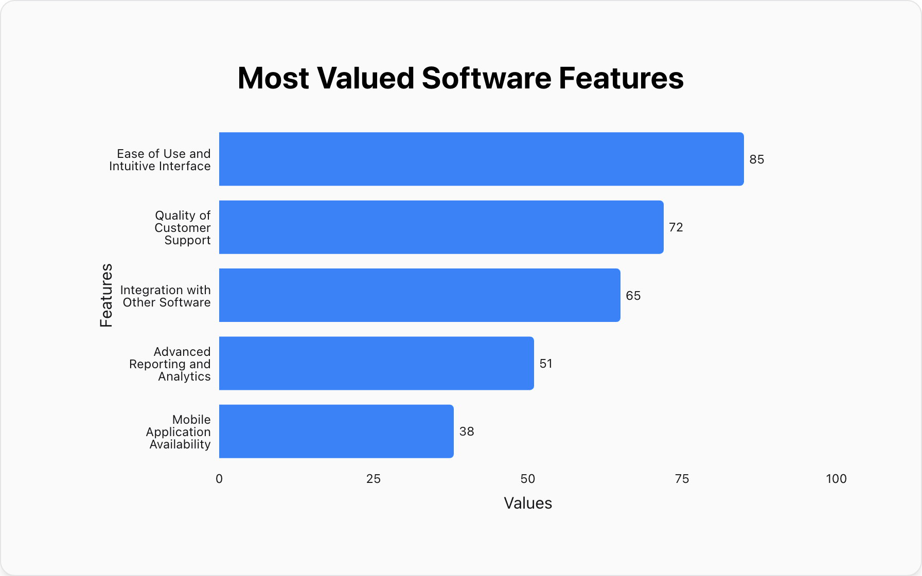
1. Ranking Performance Across Categories
This is the most classic use. A bar chart is perfect for showing the performance of different items, such as sales by product, website visitors by country, or revenue by quarter. Ordering the bars from largest to smallest makes the ranking even clearer.
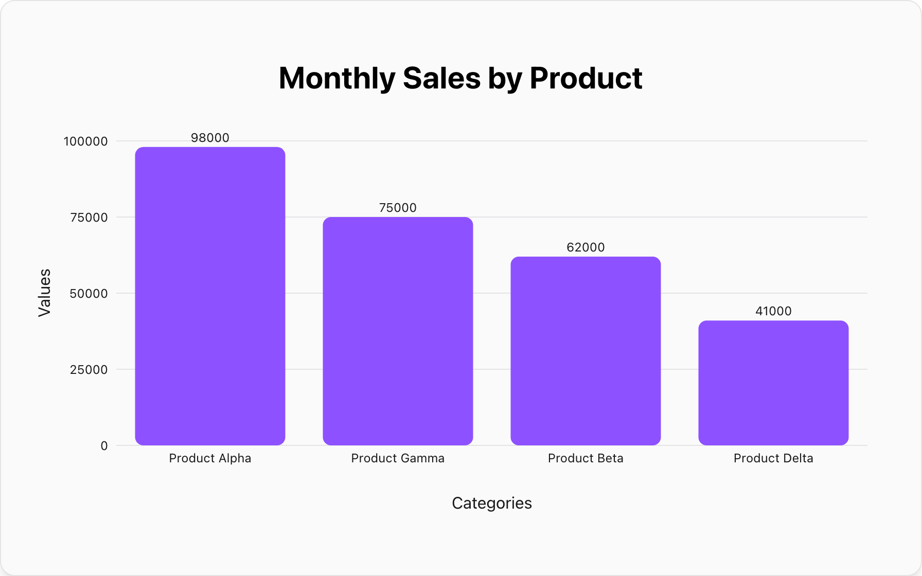
Data for this Chart:
Bar Chart "Monthly Sales by Product"
Product Alpha, 98000
Product Gamma, 75000
Product Beta, 62000
Product Delta, 41000
2. Comparing Parts of a Whole
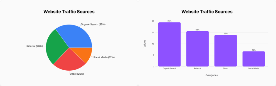
Wait, isn't this for pie charts? Yes, but when you have many categories or when the values are very close, a bar chart is often a clearer alternative. It allows for more precise comparison than a pie chart's angles. Notice how much easier it is to compare 'Content' and 'Events' here than in a pie chart.
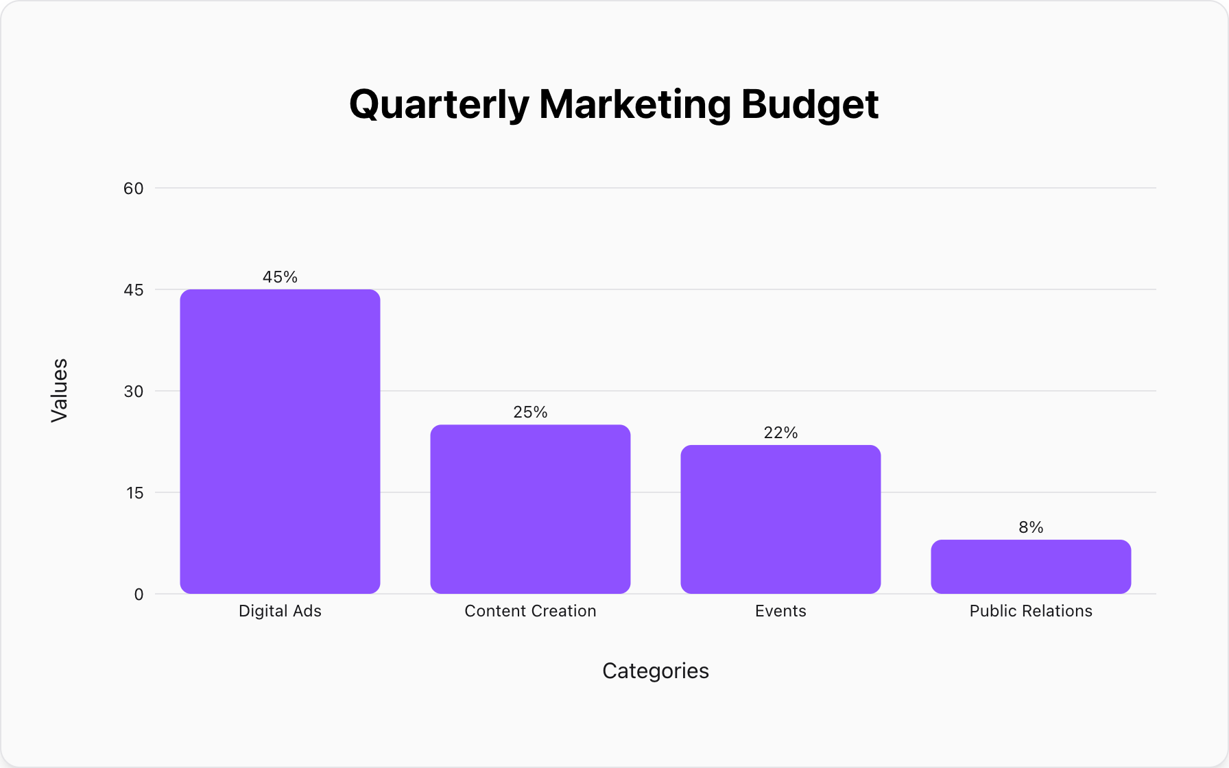
Data for this Chart:
Bar Chart "Quarterly Marketing Budget"
Digital Ads, 45%
Content Creation, 25%
Events, 22%
Public Relations, 8%
3. Displaying Data with Negative Values
This is something a pie chart simply cannot do. A bar chart can easily extend below the zero baseline to display negative numbers, making it perfect for things like profit/loss statements or comparing survey results on a scale (e.g., agree vs. disagree).
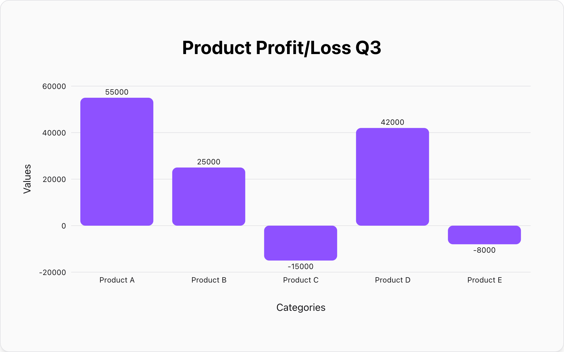
Data for this Chart:
Bar Chart "Product Profit/Loss Q3"
Product A, 55000
Product B, 25000
Product C, -15000
Product D, 42000
Product E, -8000
How Do You Design an Effective Bar Chart?
A bar chart's power comes from its simplicity, but a few design rules are non-negotiable for maintaining data integrity.
1. Always Start the Value Axis at Zero
This is the most important rule. Starting the axis at a non-zero value truncates the bars and dramatically exaggerates the differences between them. It's a common way to mislead with data. Always begin your value axis at zero to ensure an honest, proportional comparison.
2. Use Horizontal Bars for Long Labels
If your category labels are long, they can become cramped or unreadably diagonal on a standard vertical bar chart (often called a column chart). Switching to a horizontal bar chart gives your labels ample space to be read clearly from left to right.
3. Order the Data Logically
Unless your categories have a natural order (like months of the year), you should order your bars to make them easier to read. The most common method is to sort them in ascending or descending order, which helps the user quickly identify the highest and lowest values.
4. Use Color with Purpose
A single color is often all you need for a basic bar chart. If you want to draw attention to a specific category—like your company's performance versus competitors—use a distinct, highlighted color for that bar and a neutral gray for all others. This focuses the viewer's attention instantly.
When Should You NOT Use a Bar Chart?
Even this versatile tool has its limits. Using it in the wrong context can hide the real story in your data.
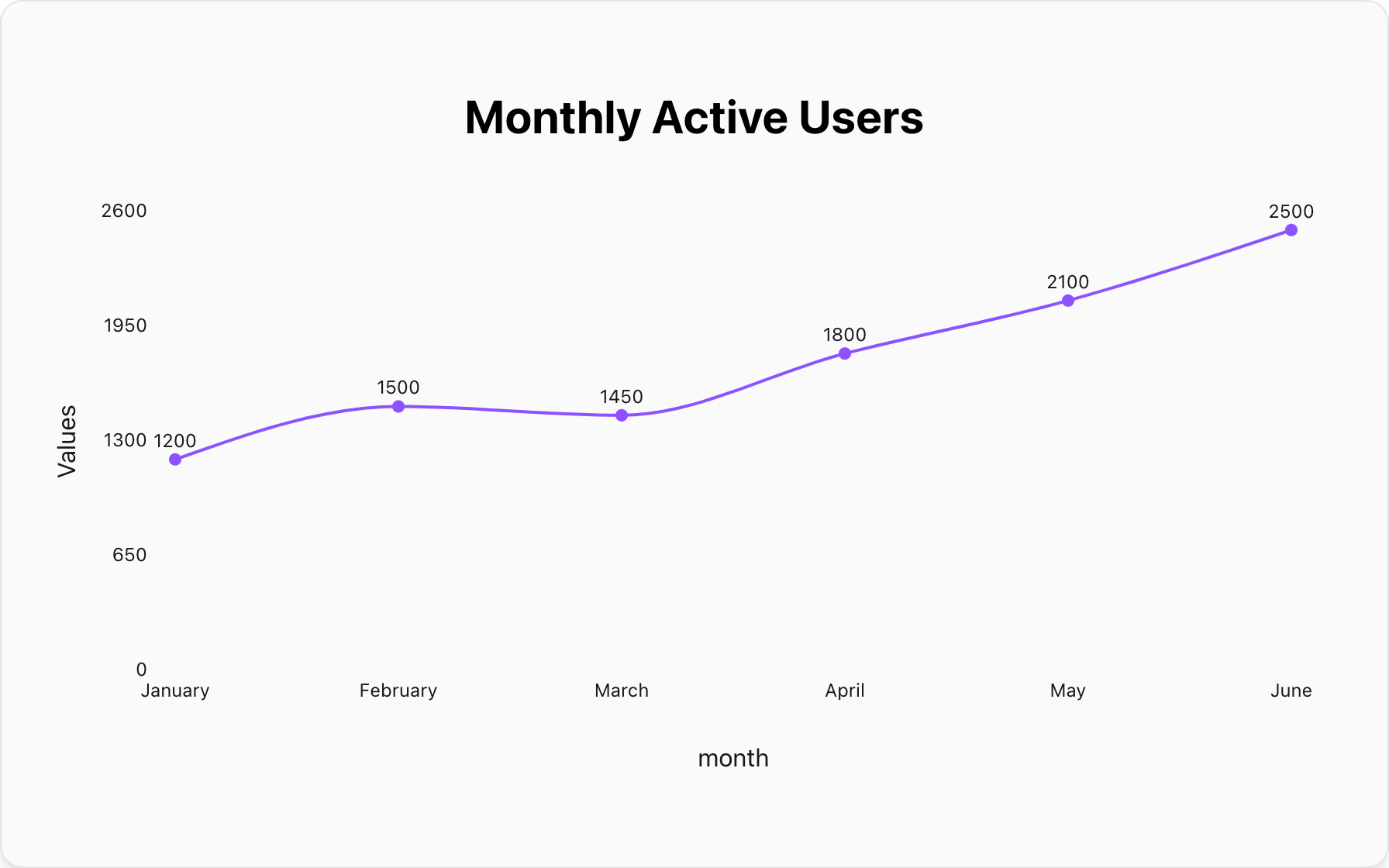
Mistake #1: Showing Trends Over Time
While you *can* use a bar chart to show values for a few time periods (e.g., four quarters), it is not ideal for showing trends. The discrete, separate nature of the bars breaks the visual continuity that shows a trend.
Better Alternative: A Line Chart.A line chart's connected points are specifically designed to highlight the rate of change and overall trend across a continuous timeframe.
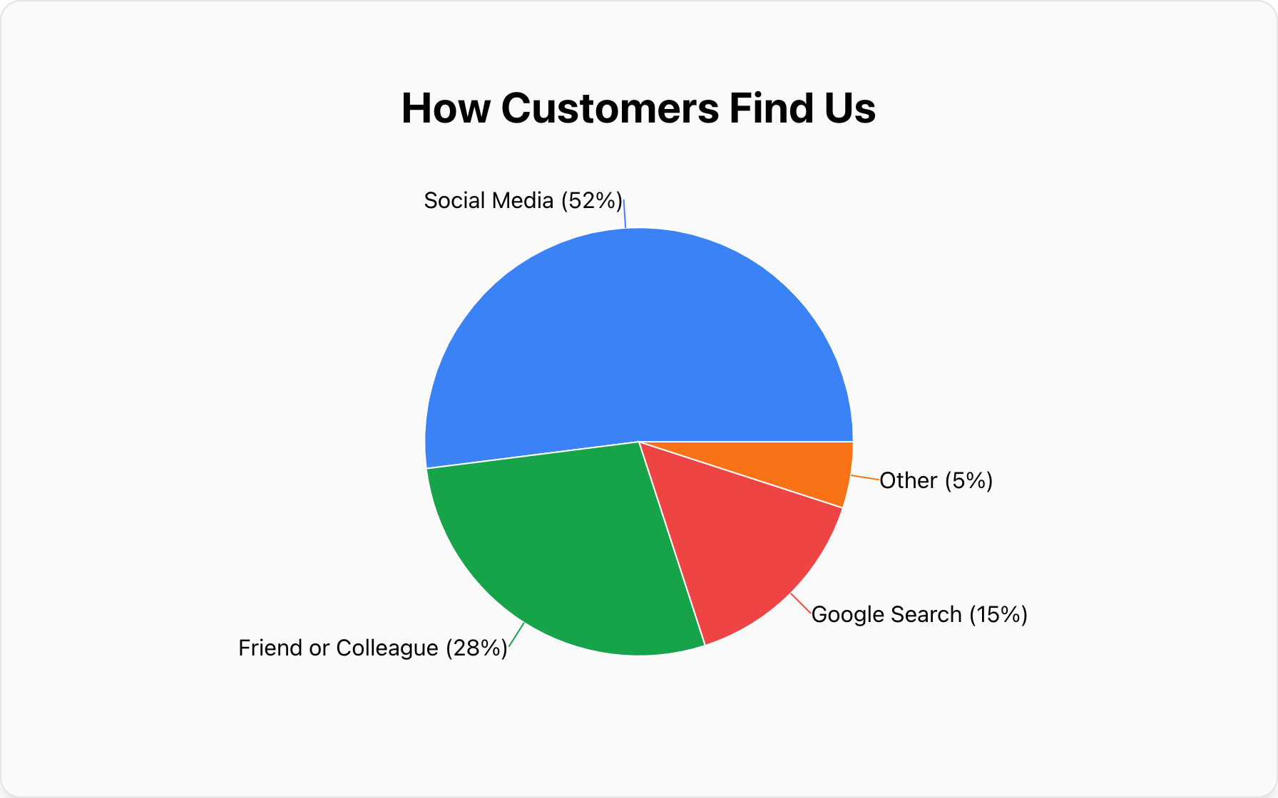
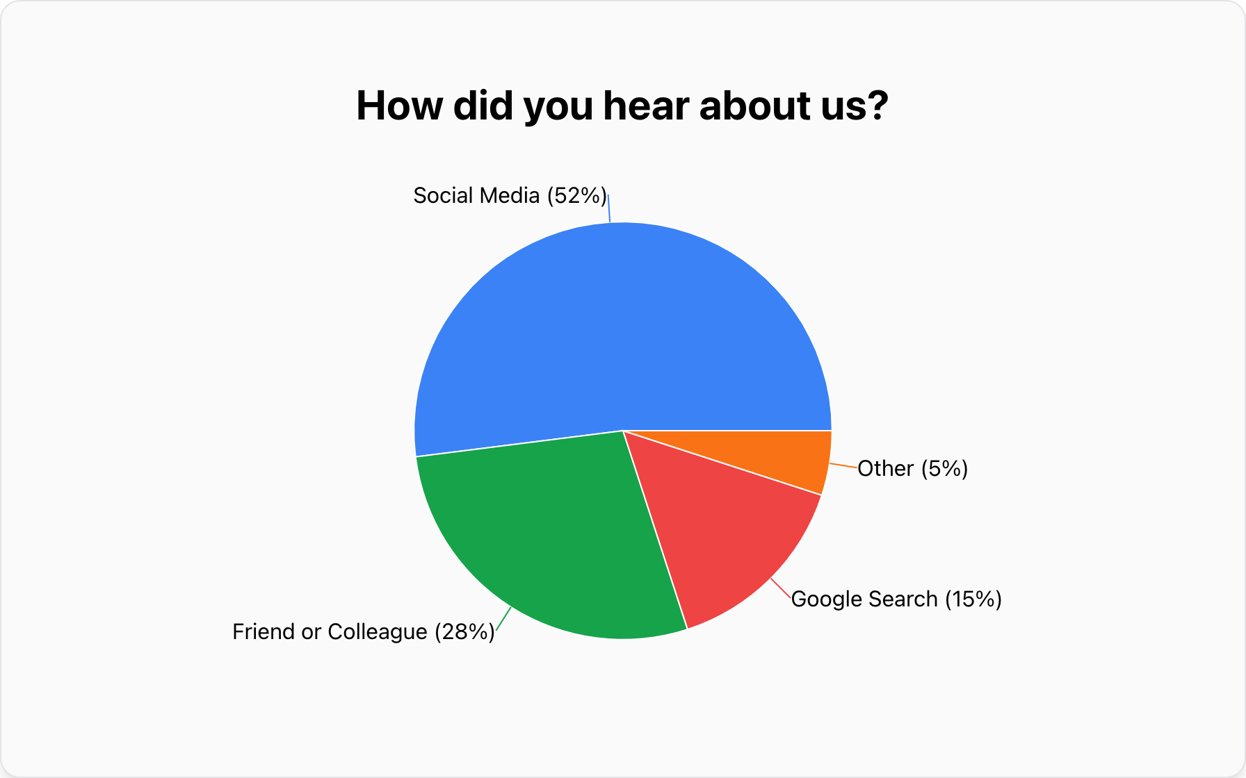
Mistake #2: Visualizing Proportional Composition
If your primary message is about the percentage breakdown of a single total (e.g., "52% of our traffic comes from Social Media"), a bar chart doesn't communicate this "part-of-a-whole" relationship as intuitively as a pie chart does.
Better Alternative: A Pie Chart.As detailed in our complete guide, a pie chart is purpose-built for showing composition when you have a few, clearly distinct categories.
Conclusion: The King of Comparison
The bar chart is the foundation of clear data visualization for a reason. Its strength lies in its simplicity and its unmatched ability to facilitate quick, accurate comparisons across categories.
Whether you're ranking products, comparing survey responses, or tracking goals, a well-designed bar chart is one of the most powerful tools you can wield. It brings clarity and integrity to your data story.
Ready to compare your own data? You can create a clear and effective bar chart for free with our tool. Simply paste your data, and turn your numbers into a compelling visual comparison in seconds.
Popular Blogs