What Is a Line Graph Best Used For? The Definitive Guide
By Kristoff
November 7, 2025
While bar charts excel at comparison and pie charts master composition, the line graph is the ultimate storyteller. It visualizes a journey, connecting individual data points to reveal trends, patterns, and fluctuations over time. It's the chart that shows you not just where you are, but how you got there.
But this powerful tool is often misunderstood. What kind of data is it truly designed for? How can you design a line graph that tells an honest and compelling story? And what are the critical mistakes that can turn a clear trend into a confusing mess?
This definitive guide will answer those questions. We will explore the line graph's core purpose, showcase its most effective uses with real-world examples, cover essential design principles, and clarify when another chart would tell your story better.
When Should You Use a Line Graph?
If you remember only one thing, let it be this: A line graph is best used for displaying the change of a continuous variable, usually over time.
Its unique strength is connecting a series of data points to visualize a trend. The X-axis (horizontal) almost always represents a continuous interval like time (days, months, years), while the Y-axis (vertical) represents a measurement. The line's slope between points shows the rate of change, making it instantly clear if a value is increasing, decreasing, or remaining stable.
"Think of a line graph as a narrative. Each point is a moment, and the line connecting them is the story of what happened between those moments. It's built to show progress and history."
What Are the Best Use Cases for Line Graphs?
Let's look at where the line graph truly excels.
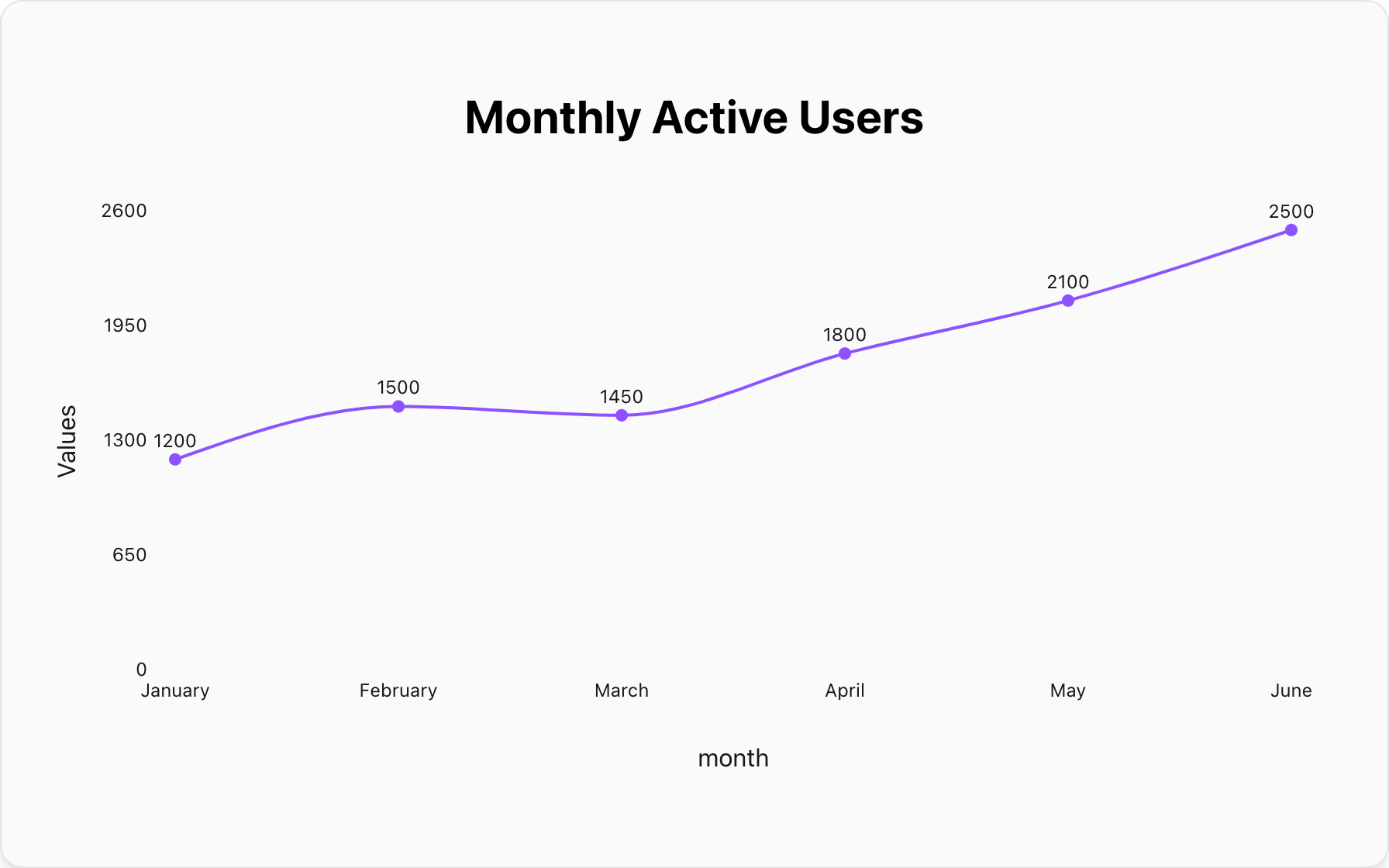
1. Tracking Website Traffic or Sales Over Time
This is a classic business use case. A line graph can effortlessly display key metrics like monthly active users, quarterly sales, or daily website sessions, making it easy to spot growth, seasonality, or the impact of a marketing campaign.
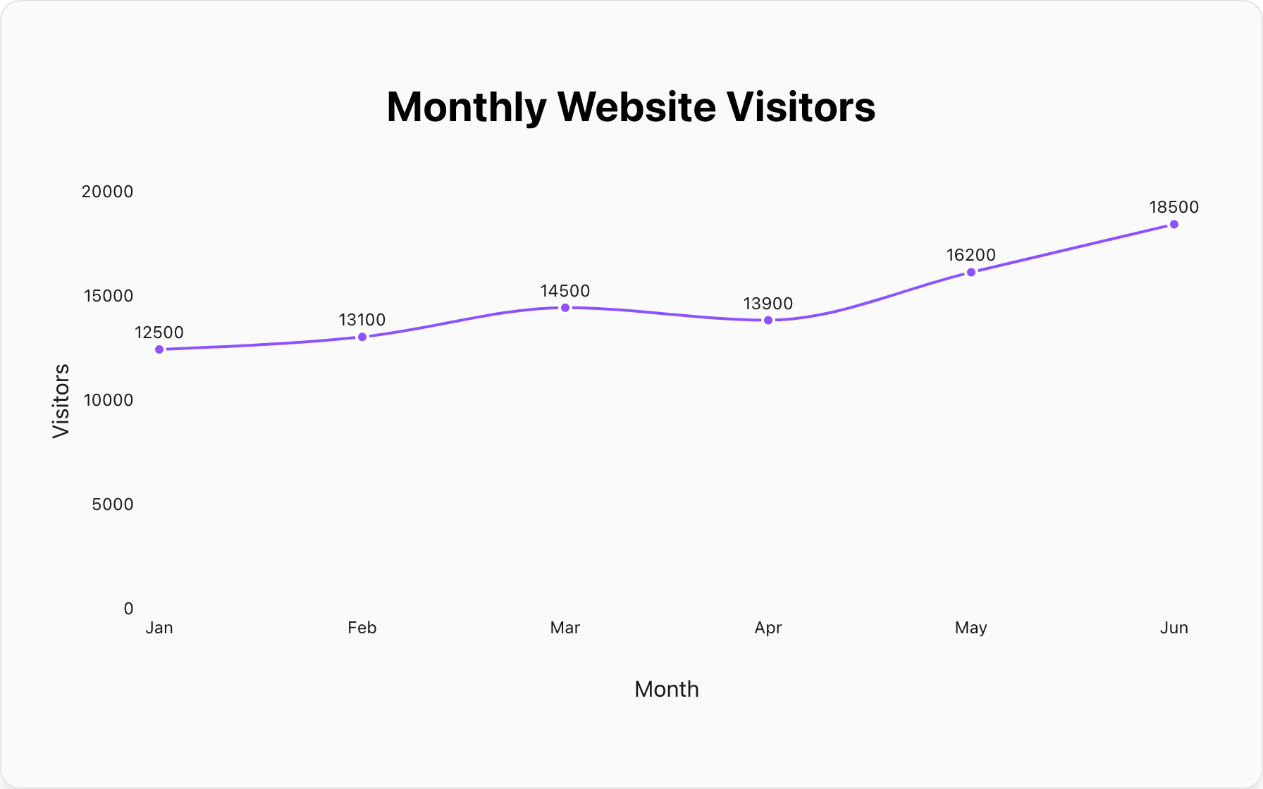
Data for this Chart:
Line Chart "Monthly Website Visitors"
Jan, 12500
Feb, 13100
Mar, 14500
Apr, 13900
May, 16200
Jun, 18500
2. Comparing Multiple Series Over the Same Time Period
A line graph is also excellent for comparing the trends of a few different categories. For example, you can plot the sales performance of three different products over the last four quarters to see which is growing the fastest. (Pro tip: limit this to 3-4 lines to avoid a confusing "spaghetti chart").
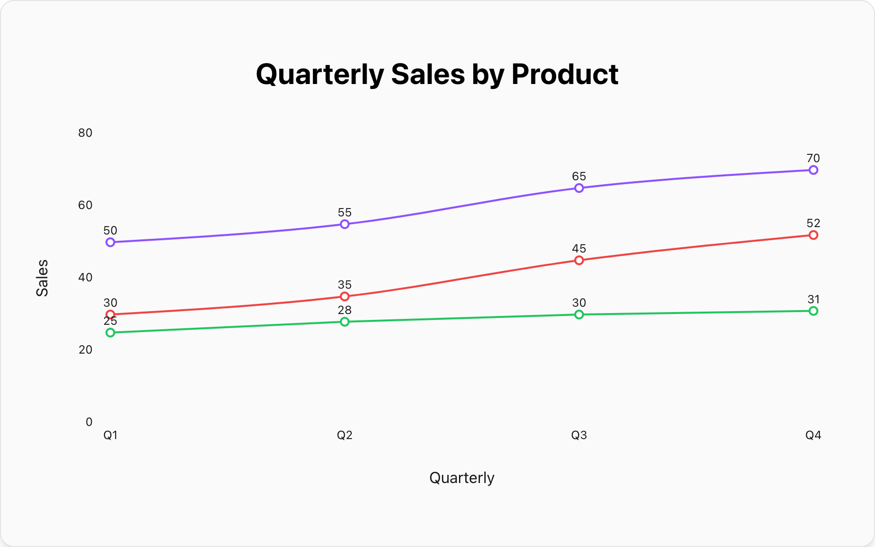
Data for this Chart:
Line Chart "Quarterly Sales by Product"
Q1, 50k, 30k, 25k
Q2, 55k, 35k, 28k
Q3, 65k, 45k, 30k
Q4, 70k, 52k, 31k
3. Visualizing Stock Price or Economic Data
Financial and economic data is almost always time-series data, making it perfect for a line graph. Tracking a stock's price, the unemployment rate, or inflation over several years reveals long-term patterns and volatility.
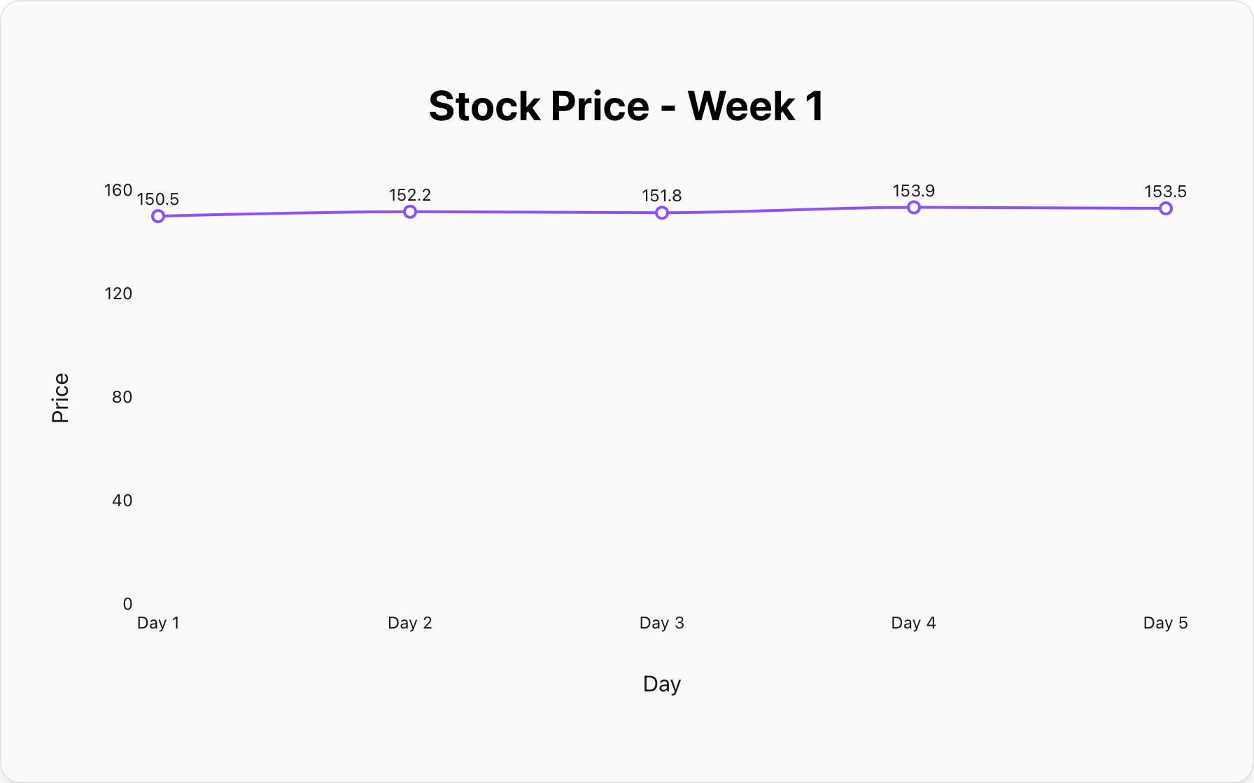
Data for this Chart:
Line Chart "Stock Price - Week 1"
Day 1, 150.50
Day 2, 152.20
Day 3, 151.80
Day 4, 153.90
Day 5, 153.50
How Do You Design an Effective Line Graph?
A well-designed line graph is intuitive. A poorly designed one can be misleading. Follow these key rules.
1. Start the Y-Axis at Zero (Most of the Time)
Similar to a bar chart, starting the Y-axis at 0 provides the most honest view of the data's volatility. Truncating the axis (starting it at a higher value) can exaggerate small changes and make them seem much more significant than they are. Only break this rule when the fluctuations are small but meaningful, as in some stock charts.
2. Label Axes Clearly and Include Units
A line graph without clearly labeled axes is meaningless. Always label the X-axis (e.g., "Month") and the Y-axis (e.g., "Revenue in USD"). This provides essential context for the reader to understand the story you are telling.
3. Use a High Data-to-Ink Ratio
This principle means you should remove any visual clutter that doesn't represent data. Avoid heavy grid lines, distracting background images, or unnecessary decorations. A clean, simple design allows the trend line itself to be the hero of the visualization.
When Should You NOT Use a Line Graph?
Using a line graph for the wrong type of data is a common but serious mistake.
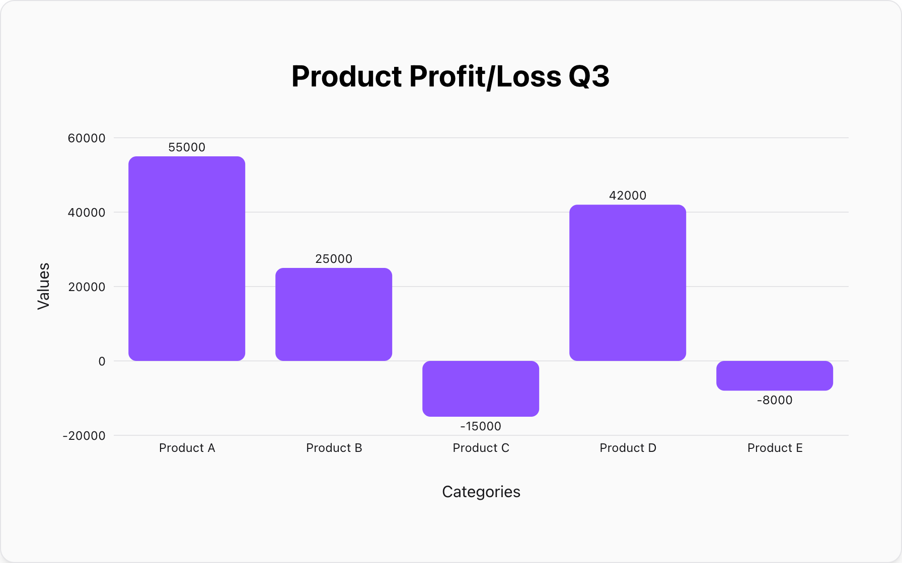
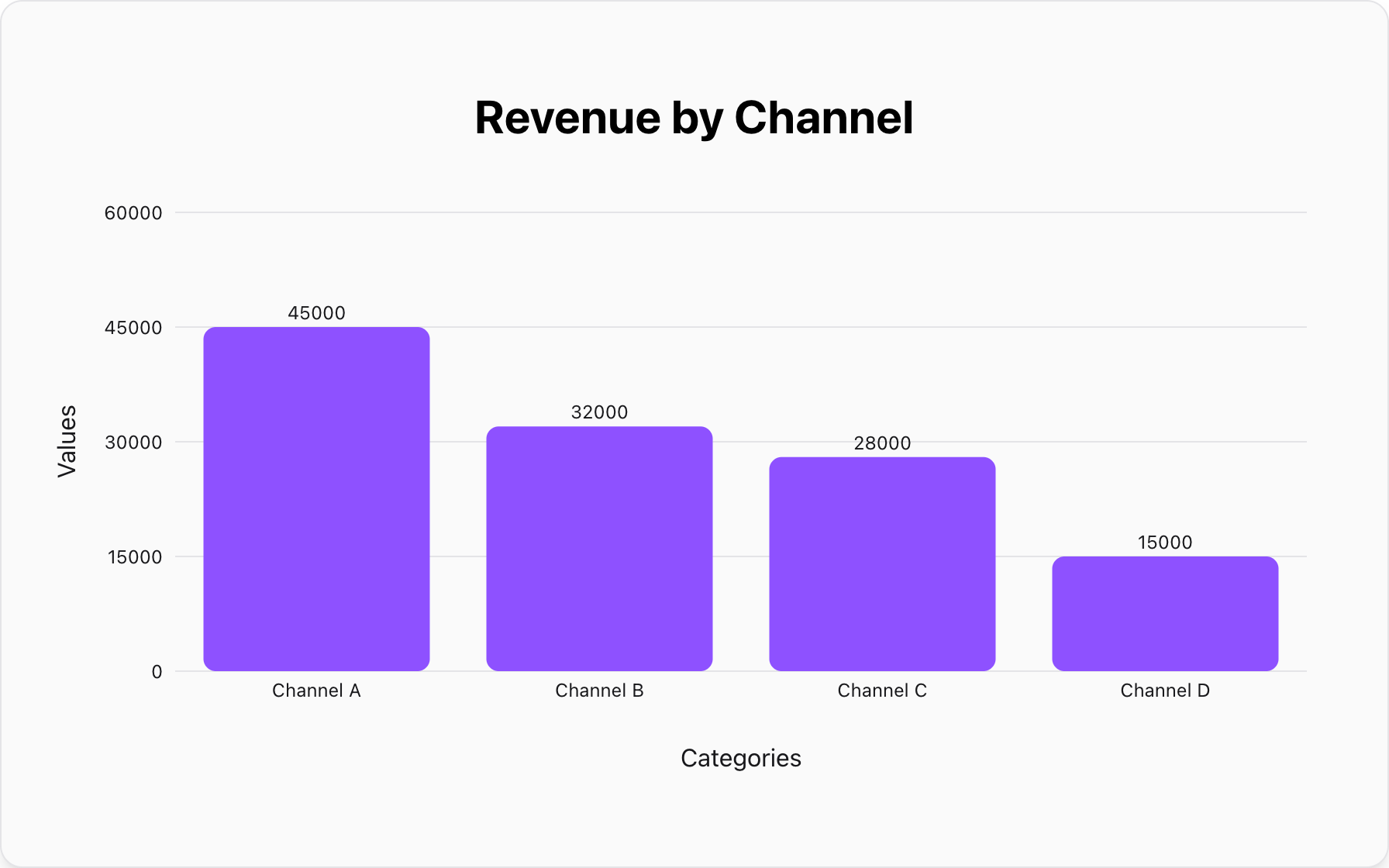
Mistake #1: Plotting Unrelated Categorical Data
The line in a line graph implies a connection and progression between points. If your X-axis represents discrete, unordered categories (like "Product A", "Product B", "Product C"), connecting them with a line is misleading. It creates a false relationship where none exists.
Better Alternative: A Bar Chart.As detailed in our complete guide, a bar chart is designed specifically to compare values across distinct categories.
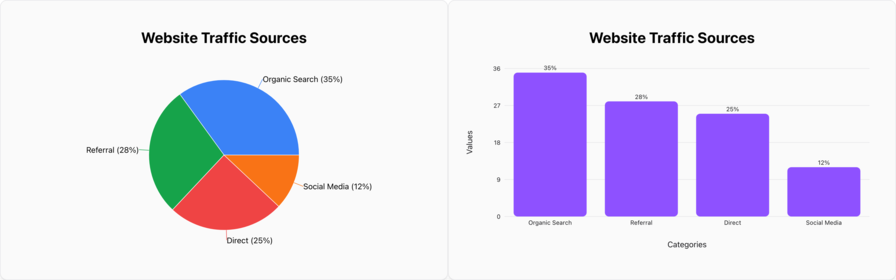
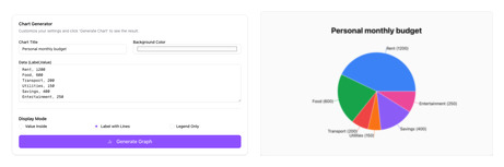
Mistake #2: Showing Part-to-Whole Composition
A line graph is not designed to show how a single total is broken down into percentages. It cannot effectively communicate the proportional size of each component relative to the whole.
Better Alternative:A Pie Chart..For showing the percentage breakdown of a few categories, a pie chart is the most intuitive and specialized tool.
Conclusion: The Storyteller of Data
The line graph is an essential tool for any data storyteller. Its power lies in its ability to transform a series of numbers into a clear and compelling narrative of change and progression.
When you need to show a trend, track performance over time, or compare the journeys of different data sets, the line graph is your best and most reliable choice.
Ready to tell your own data story? You can create a beautiful and insightful line graph for free with our tool. Paste your data and watch your trend come to life in seconds.
Popular Blogs