From Text to Chart: The Fastest Way to Visualize Your Data
By Kristoff
November 24, 2025
We've all been there. You have a simple list of data—maybe a quick budget breakdown or the results of a team vote—and you want to turn it into a chart.
You open Excel or Google Sheets. You wait for it to load. You paste your data into cells. You highlight the rows. You hunt through menus to find "Insert Chart." Then you spend the next 10 minutes fighting with formatting settings just to make the labels readable.
It feels like using a sledgehammer to crack a nut. For complex financial modeling, spreadsheets are king. But for quick, everyday visualization? There has to be a better way. Enter "Text-to-Chart."
Why "Text-to-Chart" is a Game Changer
Text-to-Chart tools (like the one you're on right now) flip the script. Instead of forcing you to structure your data into a strict grid, they understand simple, natural text lists.
- Speed: Go from raw text to a finished chart in under 5 seconds.
- Simplicity: No cells, no formulas, no complex menus.
- Flexibility: Works with data copied from emails, Slack messages, Notion docs, or even handwritten notes you type out.
How It Works: A 3-Step Guide
The process is designed to be as frictionless as possible. Here is how you can create a professional chart right now:
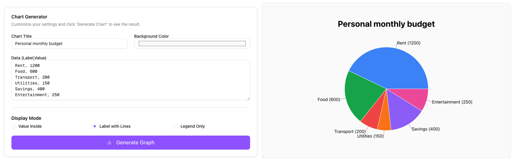
Step 1: Prepare Your Text
Just write your data as a list. Put the label first, followed by a comma, and then the value.
Rent, 1200
Groceries, 450
Utilities, 150
Savings, 300
Step 2: Paste and Generate
Paste that list into the input box on our homepage. The tool instantly recognizes the pattern.
Step 3: Download
Your chart appears instantly. You can toggle between Pie, Bar, or Line charts with one click, then download the high-resolution image for your presentation.
Real-World Use Cases
When is this faster method most useful?
1. The "Slack" Poll
You ask your team: "What should we order for lunch?" You get a stream of replies. Instead of opening Excel, just type:
"Pizza, 5 / Tacos, 8 / Sushi, 3"
Paste it, generate a bar chart, and share the image back to the channel. Decision made.
2. Quick Budget Visualization
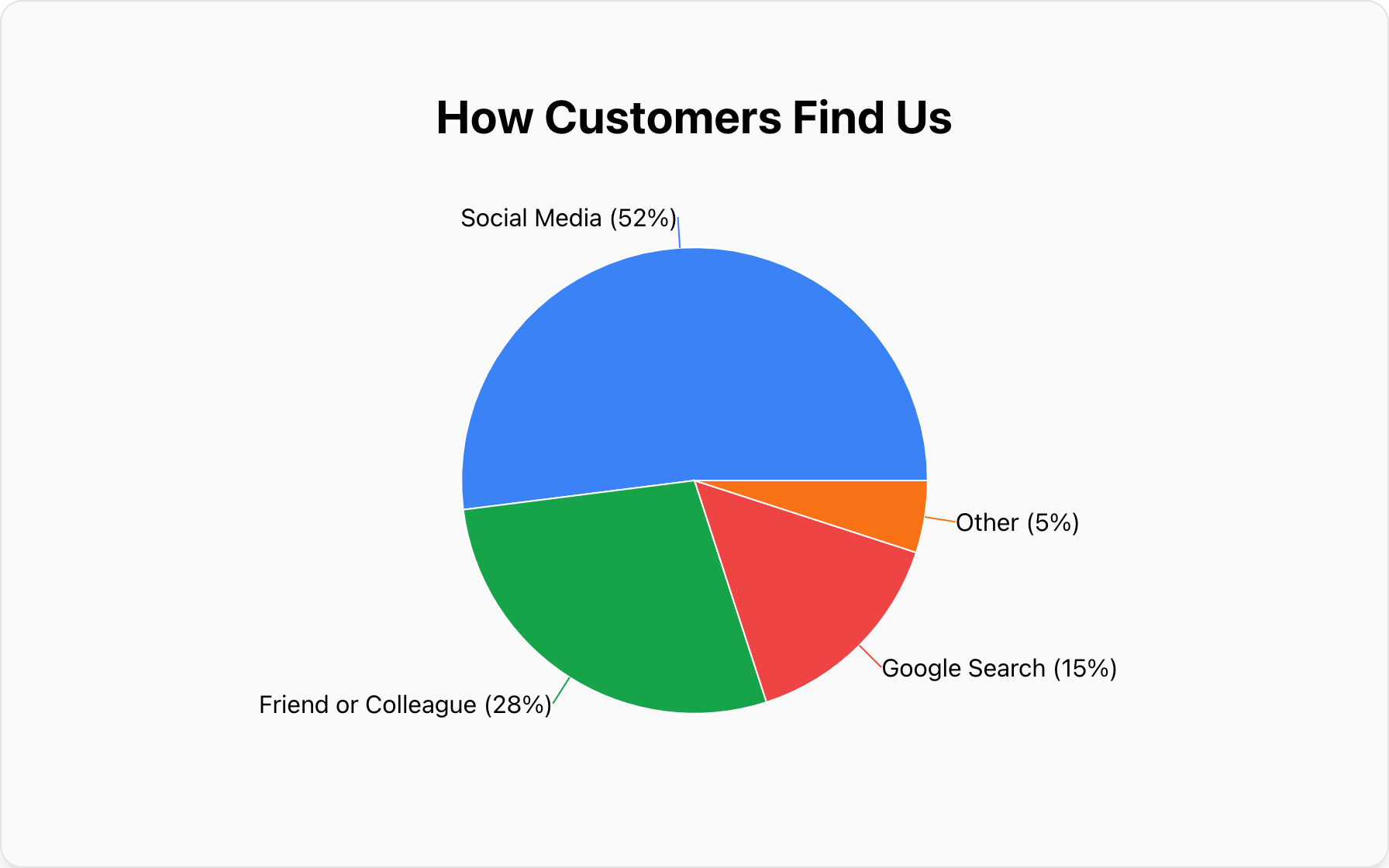
You're looking at your bank statement and wondering where the money went. Quickly list out the big categories in a text file, paste them into the Pie Chart Maker, and instantly see that "Dining Out" is taking up 40% of your pie.
Conclusion: Choose the Right Tool
If you need to perform regression analysis or manage a 10,000-row database, please, stick with Excel. It's a fantastic tool.
But if you just need to visualize a simple idea fast, stop overcomplicating it. Text-to-Chart is the modern, efficient way to communicate with data.
Popular Blogs