Blog
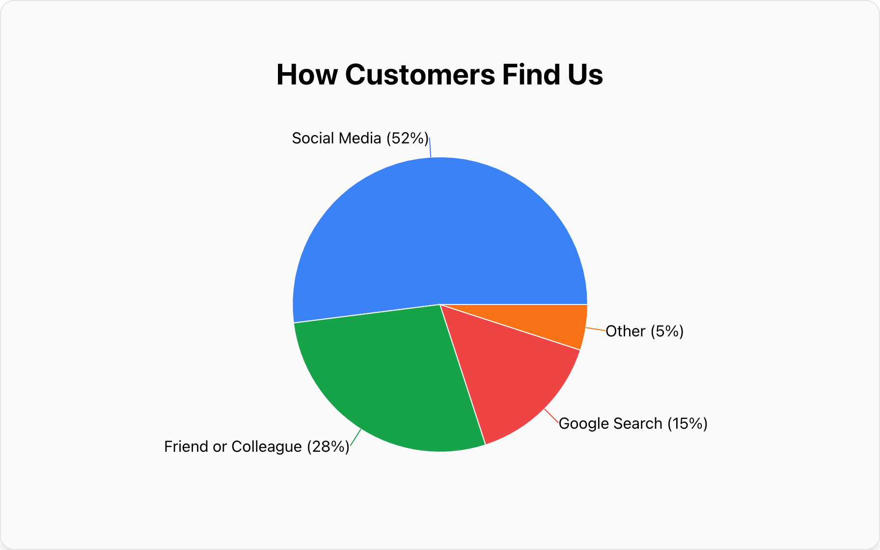
What Are Pie Charts Best Used For?
Discover what pie charts are best used for. This guide explains how to use them for showing part-to-whole relationships and when to use a bar or line chart instead.
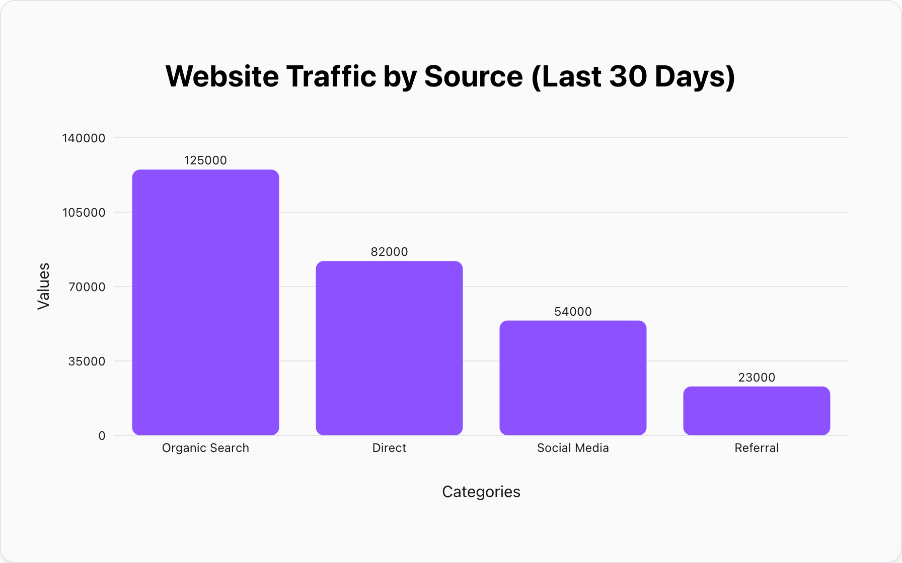
What Are Bar Charts Best Used For?
Discover the golden rule of bar charts: precise comparison. This ultimate guide explains what bar charts are best used for, the different types, and when you should choose a pie or line chart instead.
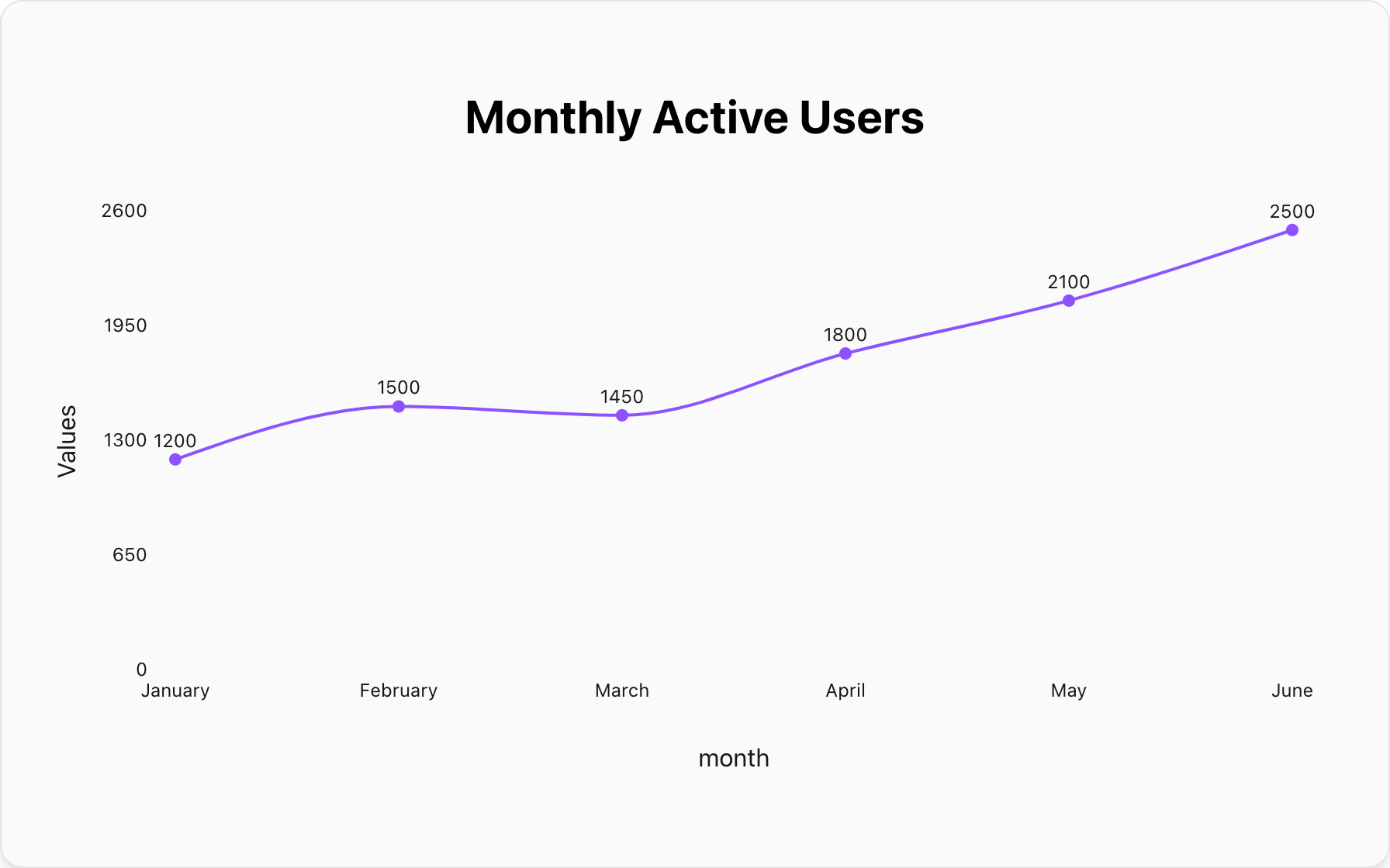
What Is a Line Graph Best Used For?
Learn the golden rule of line graphs: visualizing trends over time. This definitive guide explains what a line graph is best used for, how to compare data series, and when to use a bar or pie chart instead.
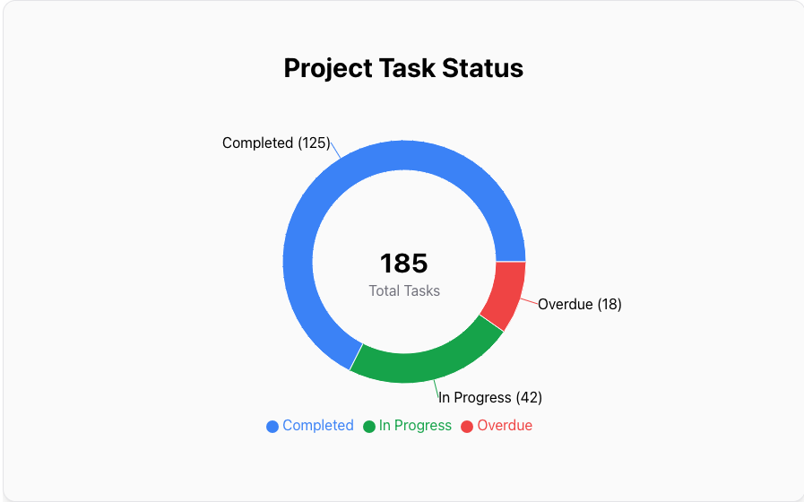
What Is a Doughnut Chart Best Used For?
Learn the golden rule of doughnut charts: visualizing composition with an added focal point. This guide explains what a doughnut chart is best used for, the key differences vs. a pie chart, and when to use a bar or line chart instead.
What Is a Horizontal Bar Chart Best Used For?
Learn the golden rule of horizontal bar charts: perfect readability for long labels. This guide explains what they are best used for, why they are superior to vertical charts for complex data, and when a line graph is the better choice.
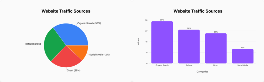
Pie Chart vs. Bar Graph: Which One Should You Use?
Confused about when to use a pie chart vs. a bar graph? This simple guide explains the critical difference: composition vs. comparison. Learn the one rule that will help you choose the right chart for your data every time.
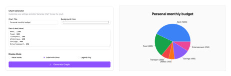
From Text to Chart: The Fastest Way to Visualize Your Data
Stop wrestling with complex spreadsheet software. Discover the power of text-to-chart generation: the fastest way to turn simple text lists into professional pie charts, bar graphs, and more in seconds.
How to Visualize CSV Data Without Excel: The Fastest Way
Need to turn a CSV file into a graph but don't want to use Excel? Discover the fastest online method to turn raw comma-separated values into beautiful charts instantly.

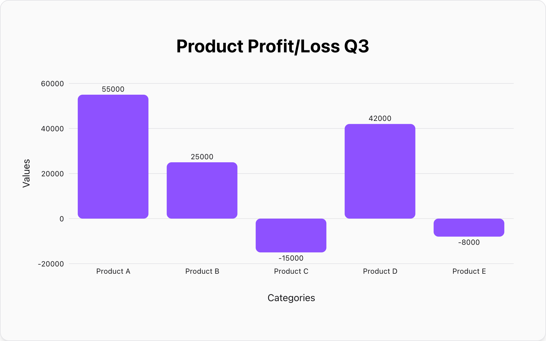
5 Common Mistakes in Data Visualization (And How to Fix Them)
Are your charts confusing your audience? Learn the 5 most common data visualization mistakes—from 3D effects to truncated axes—and how to fix them for professional results.